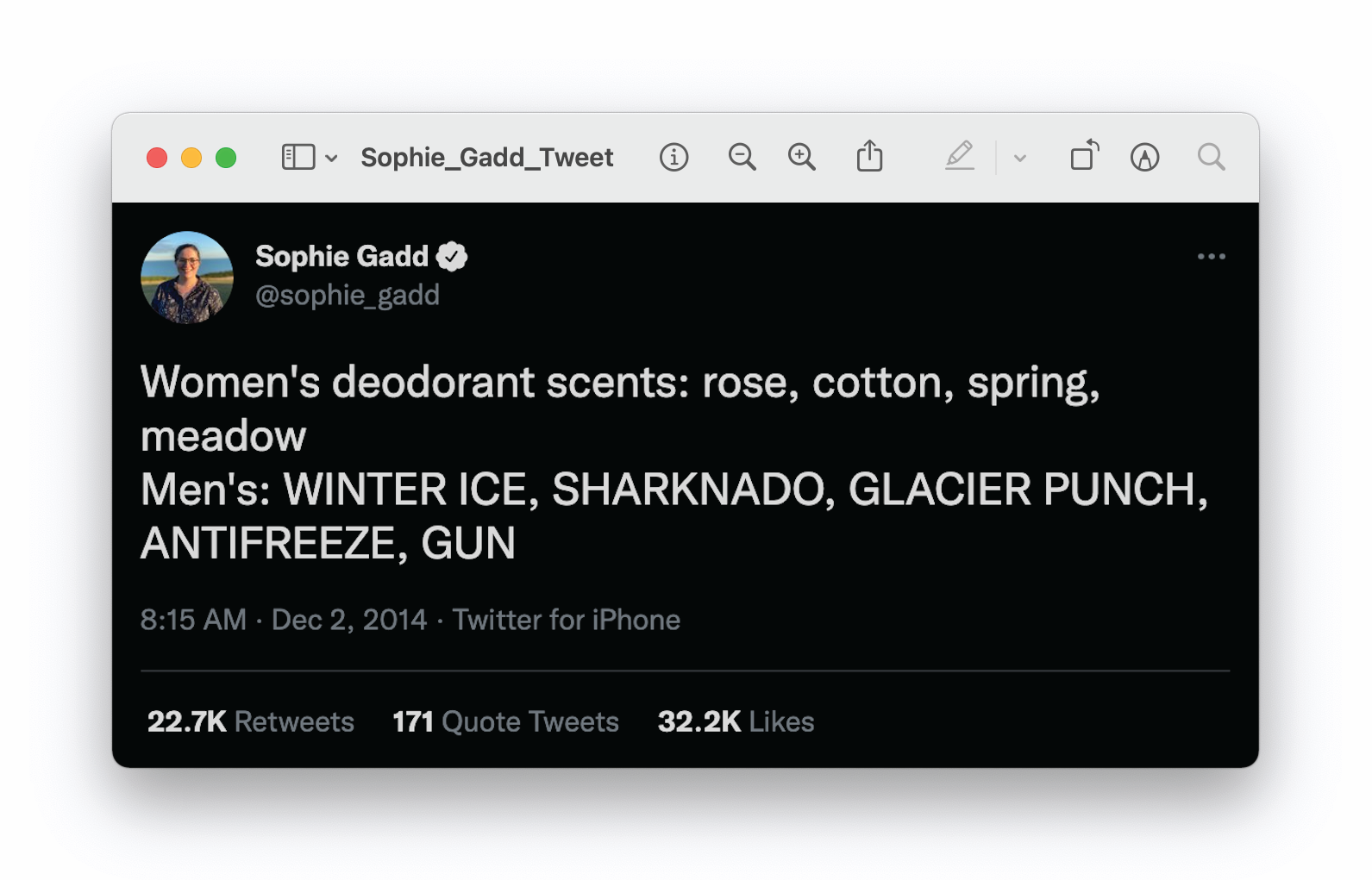
After personal experiences with binary skincare products, tailored to highly specific and stereotyped demographics (satirised by the posted tweet), I recognised a need for skincare identities that reflect the emotional experience of skin maintenance, transcending traditional gender stereotypes.
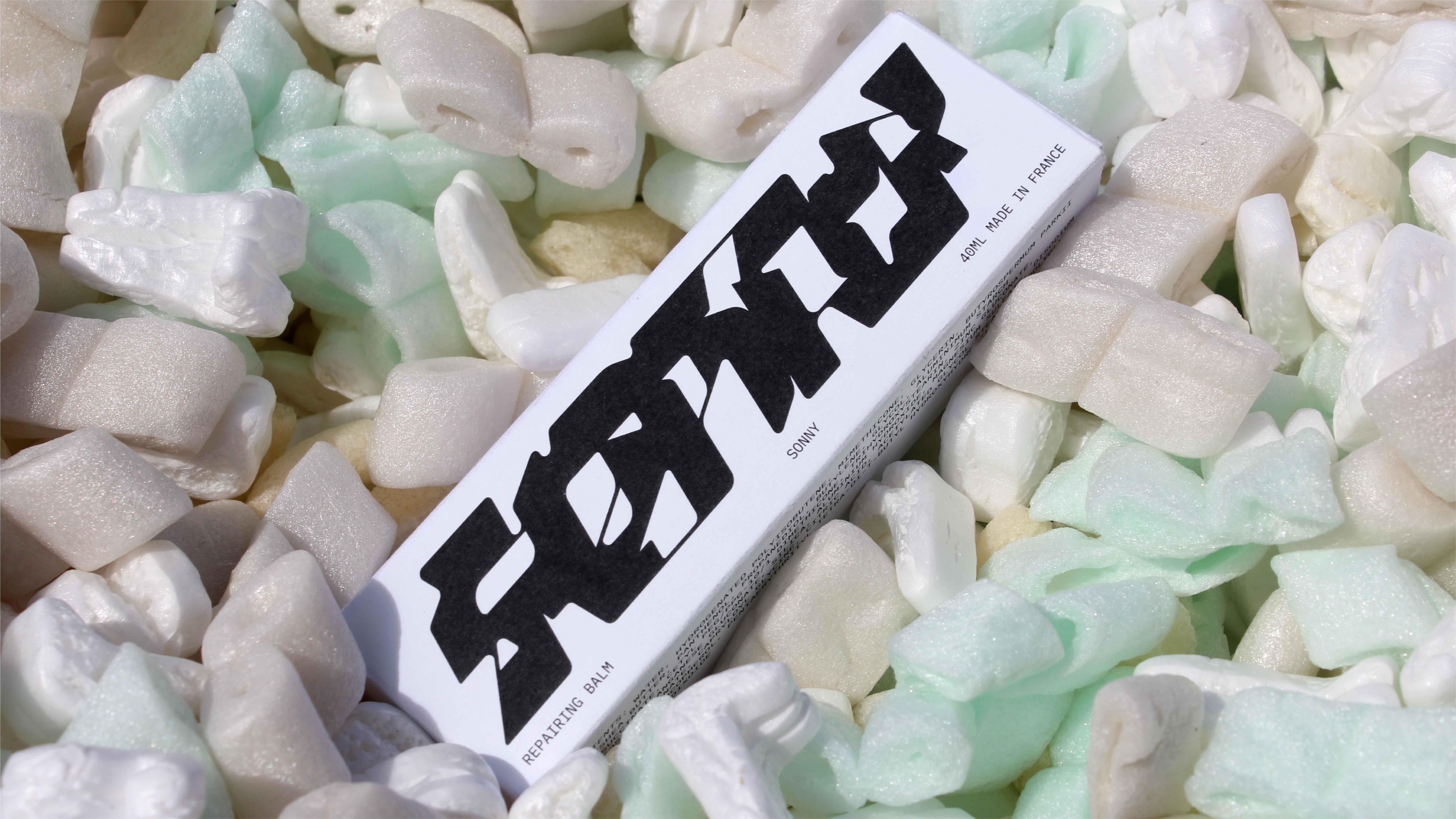
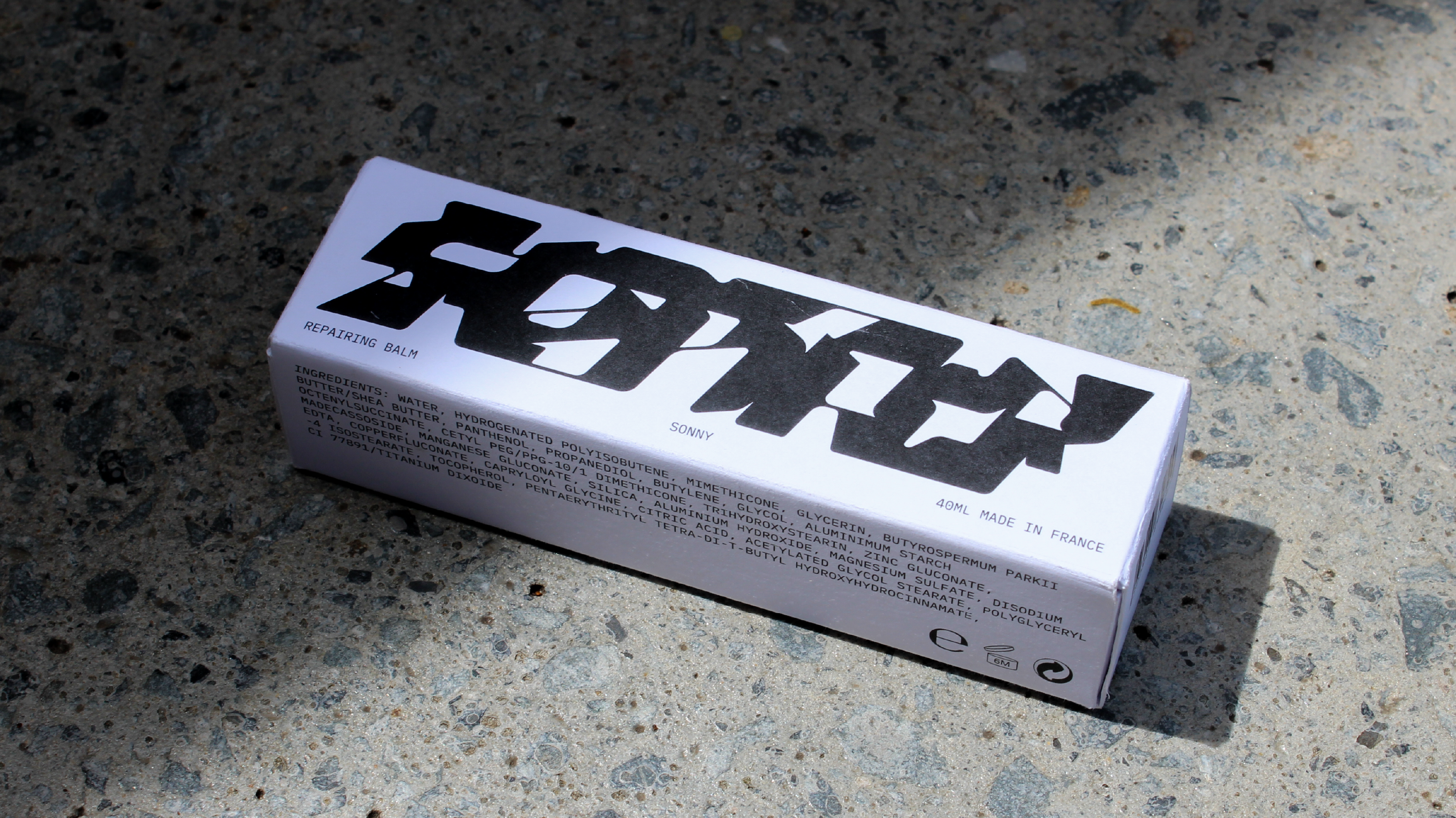
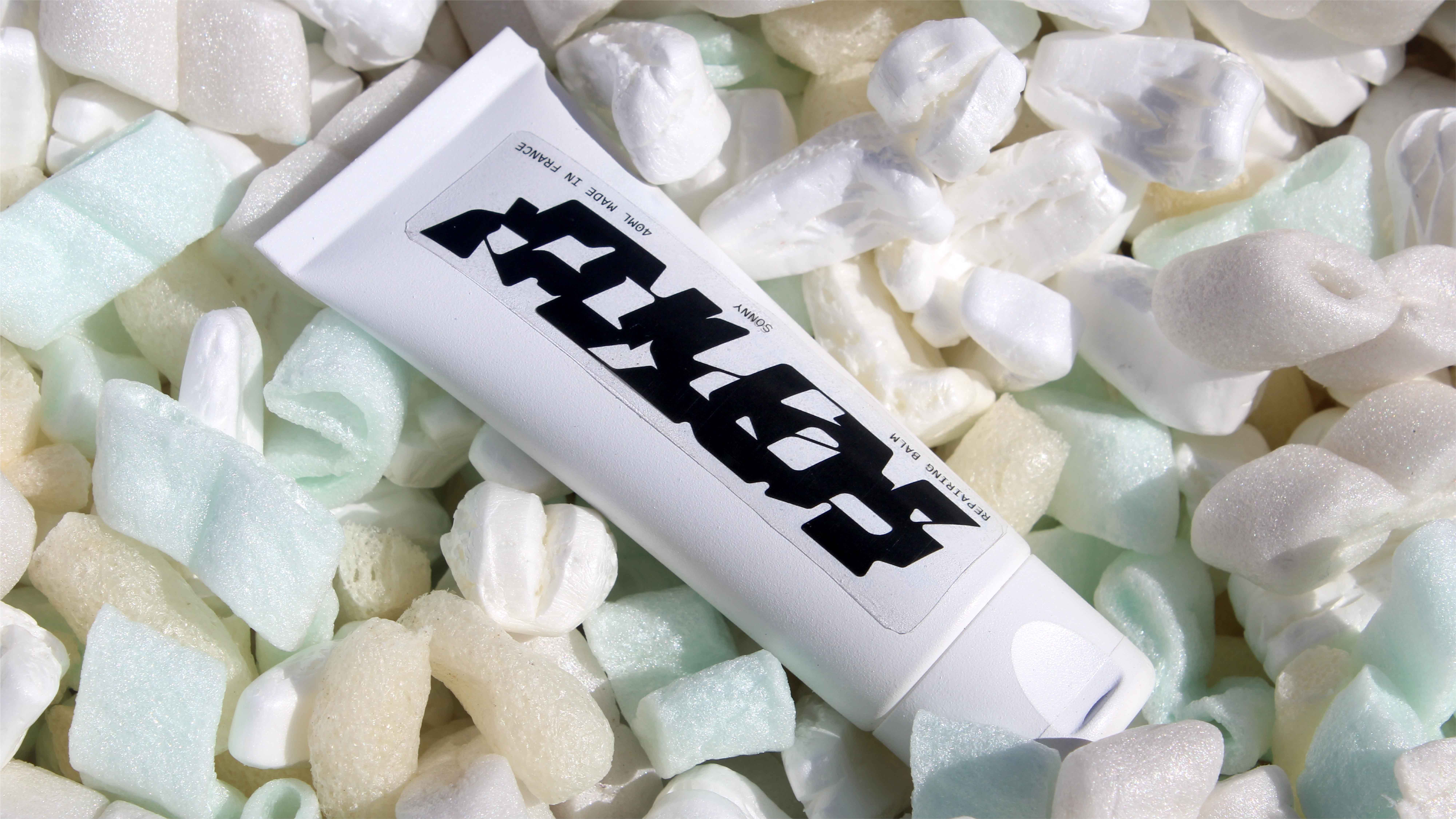
Collected through brief, informal questionnaires, word associations were tabulated and tallied for project reference, tying sensory skin care experiences to the visual identity. This, in turn, led to gender-neutral, but emotionally rich packaging, monochromatically coloured and led by an expressive word-mark.
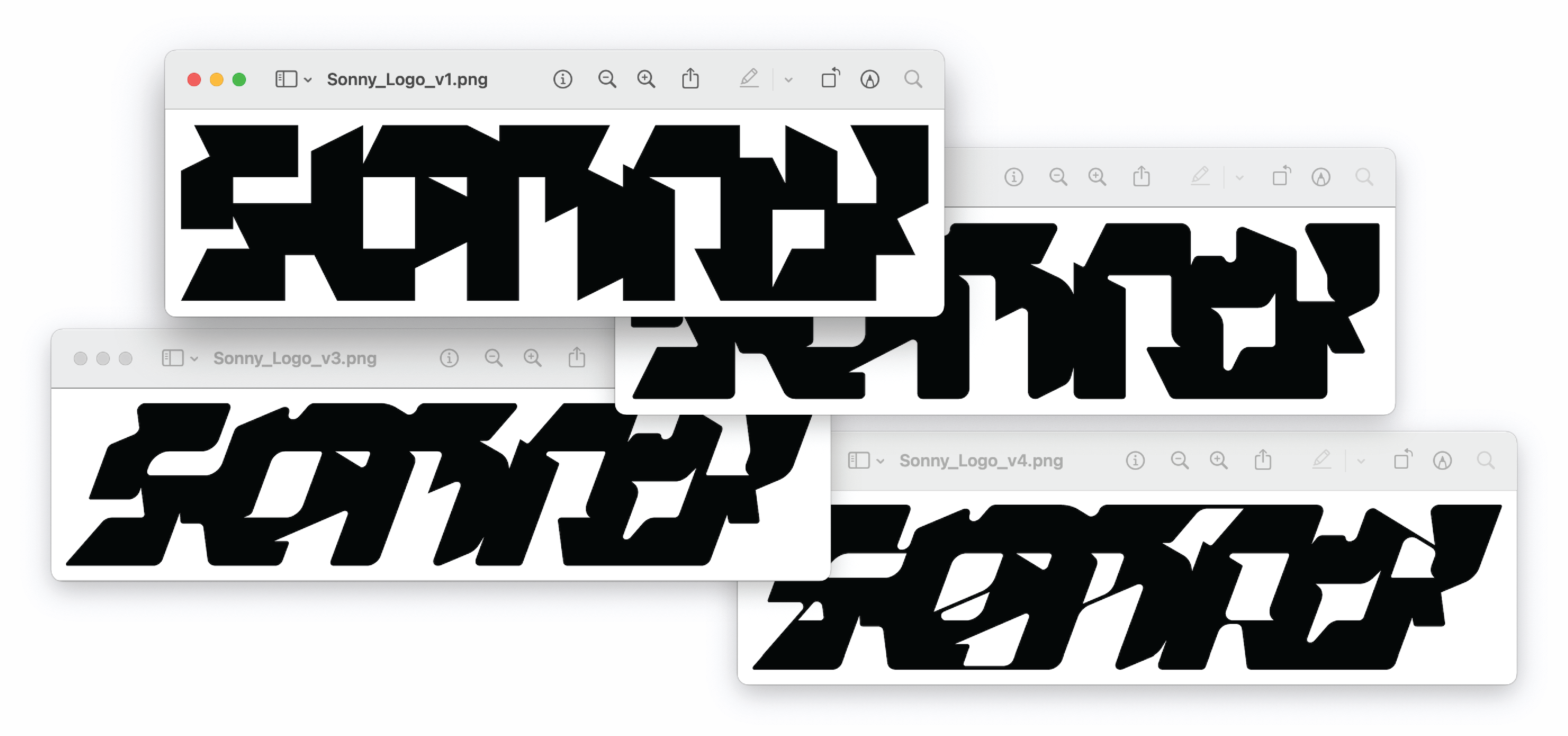
The final Sonny mark takes visual cues from juxtaposing forms, built on a jagged base, and later smoothed and sculpted, to reflect the contrast between the feel and form of the packaging and the product within.
Objective: Create emotionally relatable and gender-neutral skin care branding.
Research and Inspiration: Brief store visits and catalogued word associations.
Technique: Paper sketches of word-mark, using rhomboids as base.
Refinement: Type softened through Illustrator, packaging designed around word-mark. Motion added for energy.
Medium: Printed onto white uncoated stock, contrasting glossy tube inside.

