Project
Year
Software
Client
Bijou
2021
Glyphs
Personal
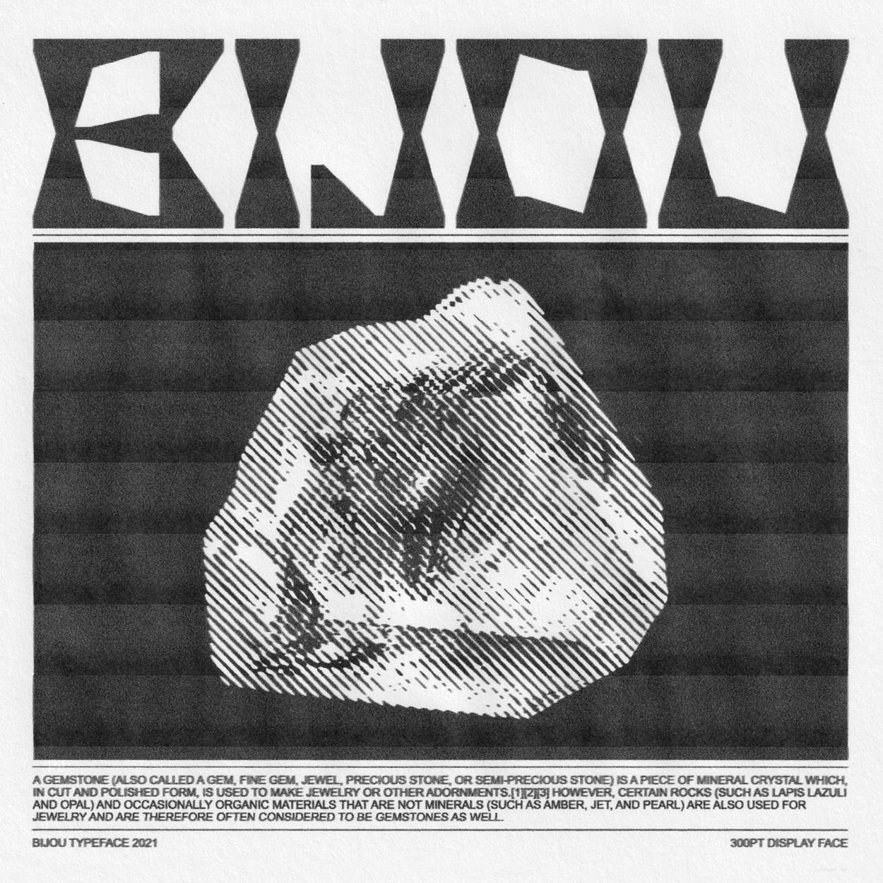
Fascinated by the visual language of juxtaposition in the movie Uncut Gems, namely, the bejewelled Furby against the city in which it resides, the glistening gem against its source, or an unkempt Adam Sandler against the jewellery that adorns him, I was compelled to explore the influence behind these storytelling decisions further.
Throughout the production of Unciut Gems, American architect Michael Graves acted as one of the Safdie brothers’ key visual and philosophical muses, through his often-polarising architecture and postmodernist ideologies, manifesting in the belief that art should be accessible.
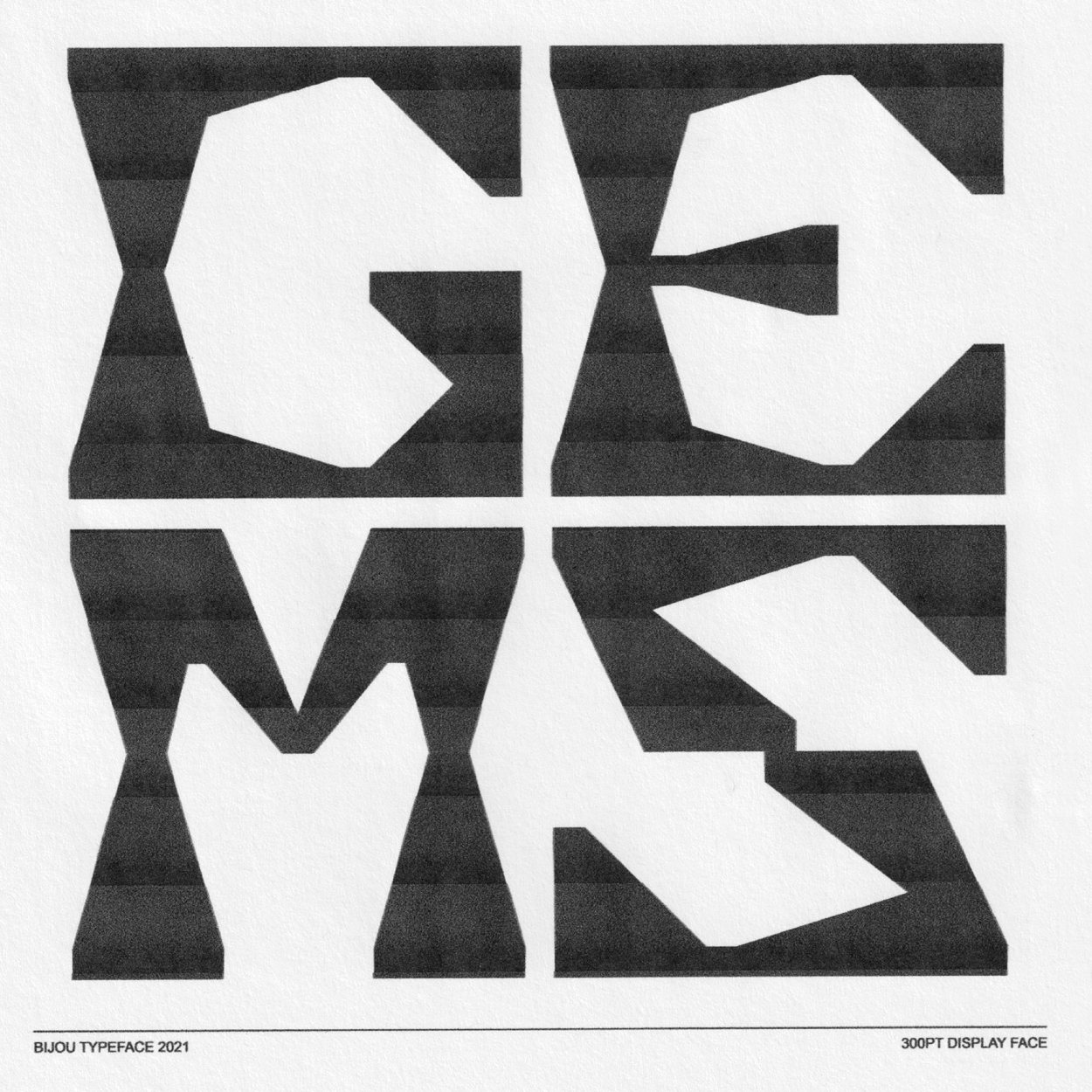
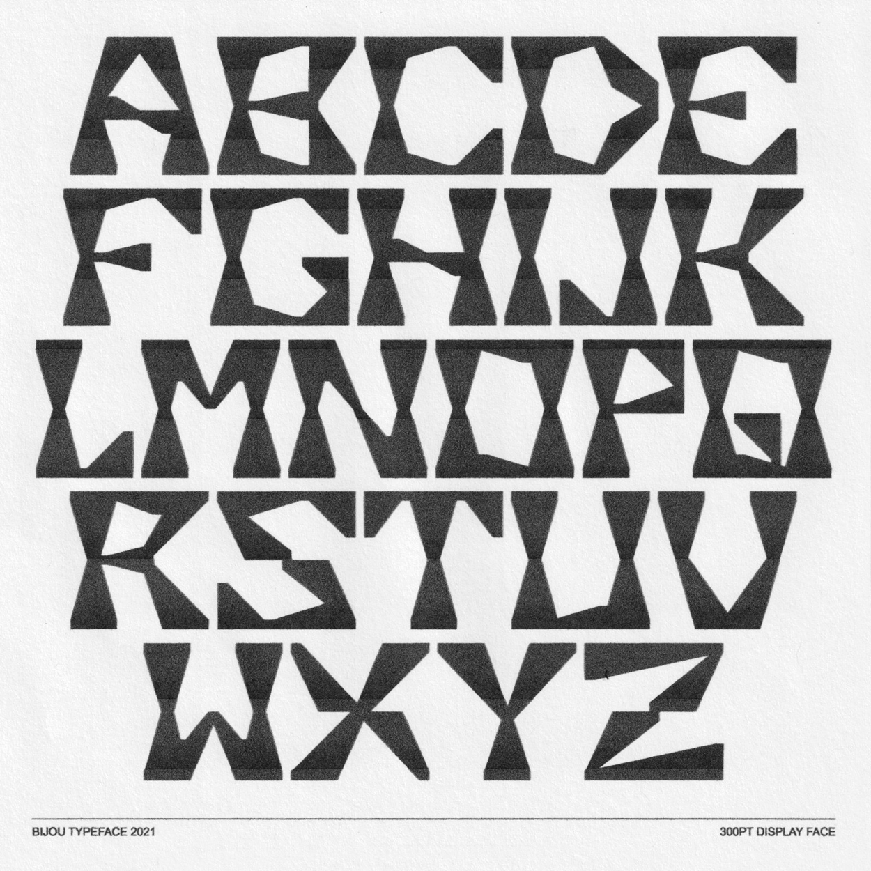
Initial sketches were built from a series of simple rough shapes, much like an amateur stone carving, or an unearthed gem. Drafts were further refined in Glyphs, using consistent forms as building blocks.
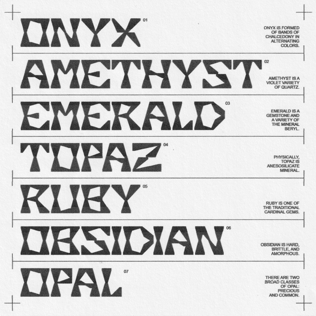
The final type was printed and scanned, producing extreme, but natural imperfections, mimicking the raw grit and energy of the movie that inspired it.
References
Step-by-step
Outcome


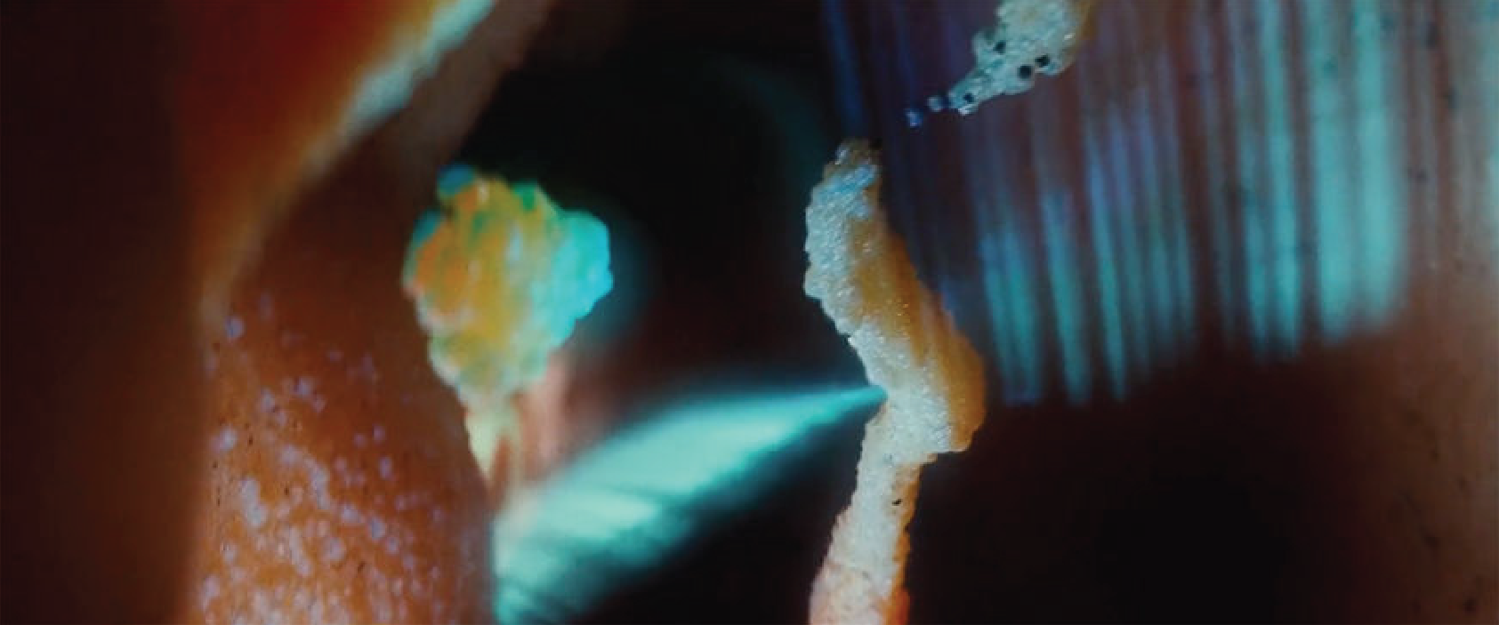
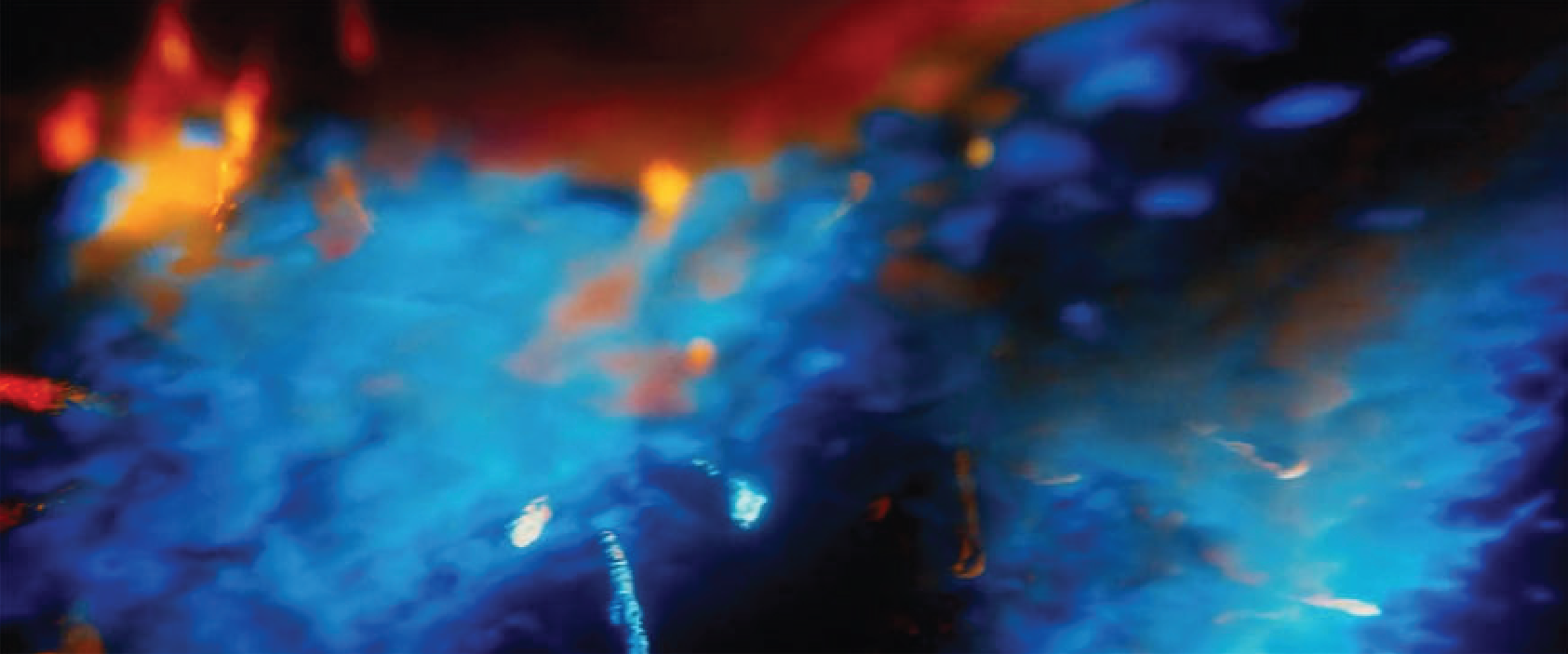

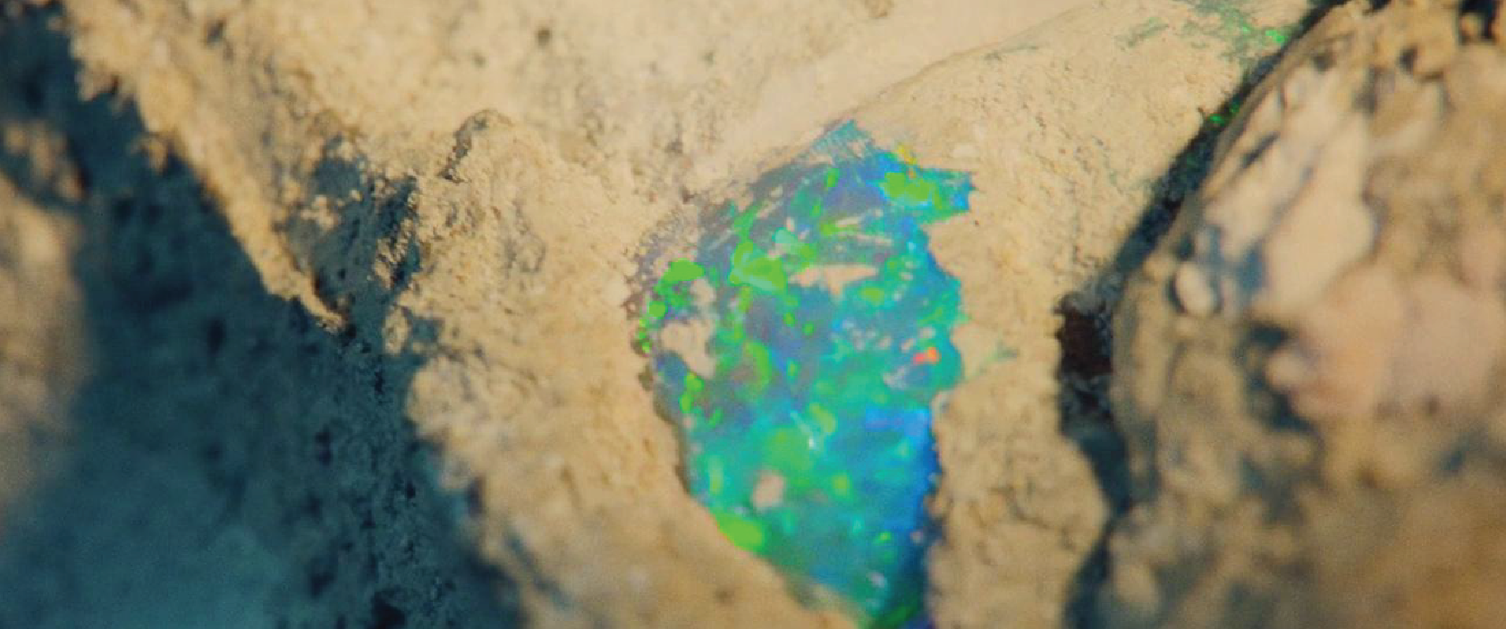
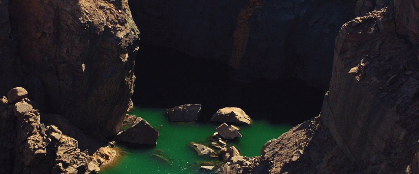
Objective: Produce typeface that reflects the visual language within ‘Uncut Gems’.
Research and Inspiration: Stills of Uncut Gems’ opening and KMH Gems and Jewelry store interior. Michael Graves’ postmoderist architecture and philosophy.
Technique: Simple phrases created from triangles, sketched freehand.
Refinement: Limited set of shapes built for use in construction of typeface. Type printed and proofed, tested in a variety of sizes.
Medium: Referencing grit of film, printed and scanned at low quality.
