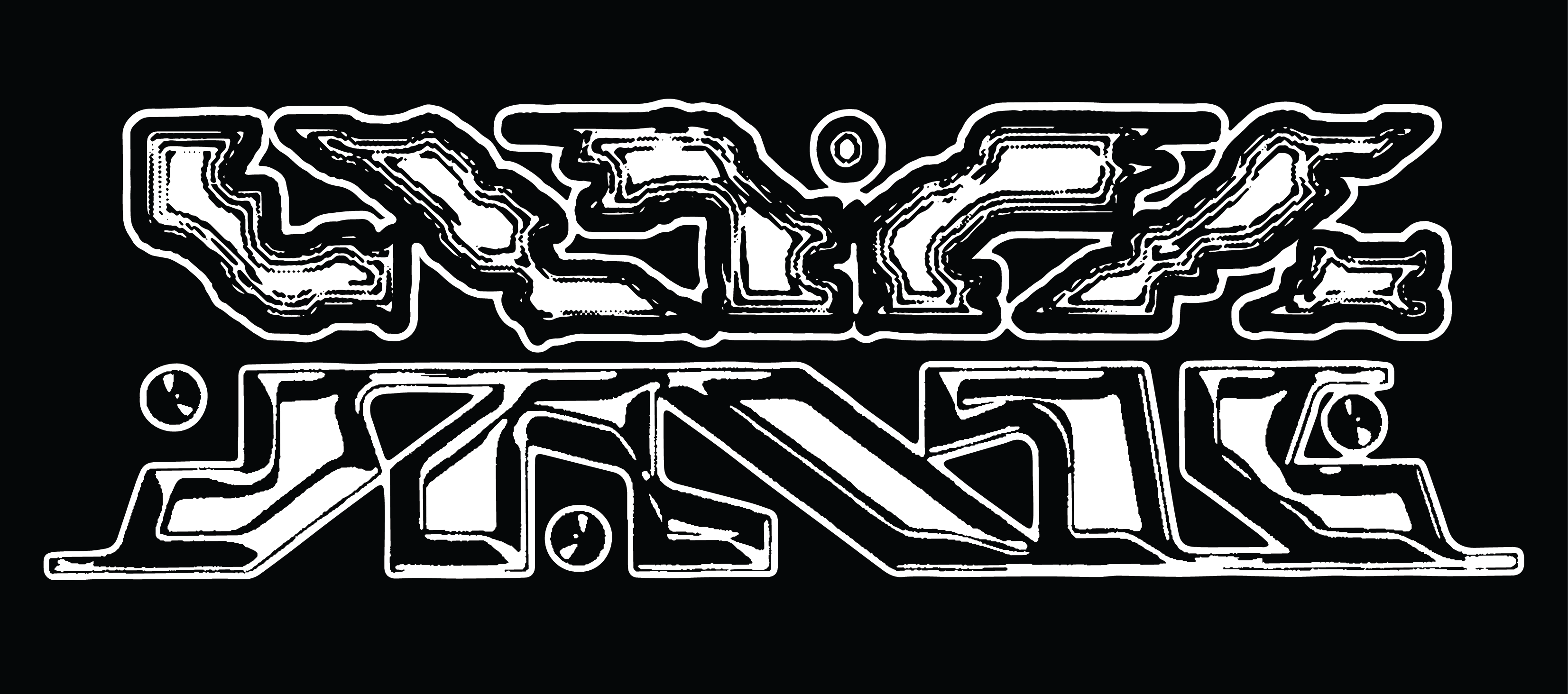
Don Broco (2023)
Lettering for Don Broco’s 2022/23 merchandise range.
“Don Broco” lettering based on grid systems from Tron (1982), with intentions of legibility and futurism through a concrete foundation, contrasting airy “stardust” shirt design theme.
“Ultrasonic” lettering, briefed to be psychedelic and otherworldly, was informed by visualisations of sonic rays, and the silhouette of the USS Enterprise.
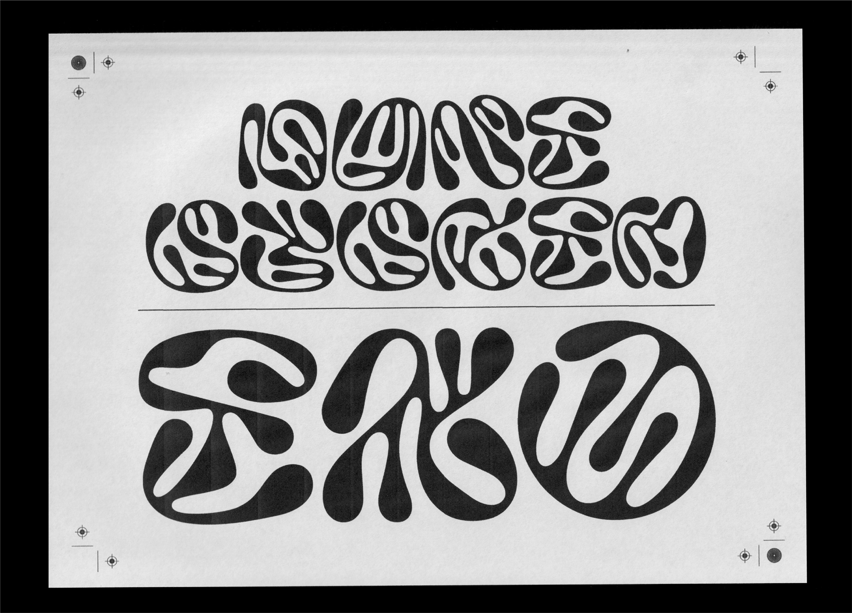
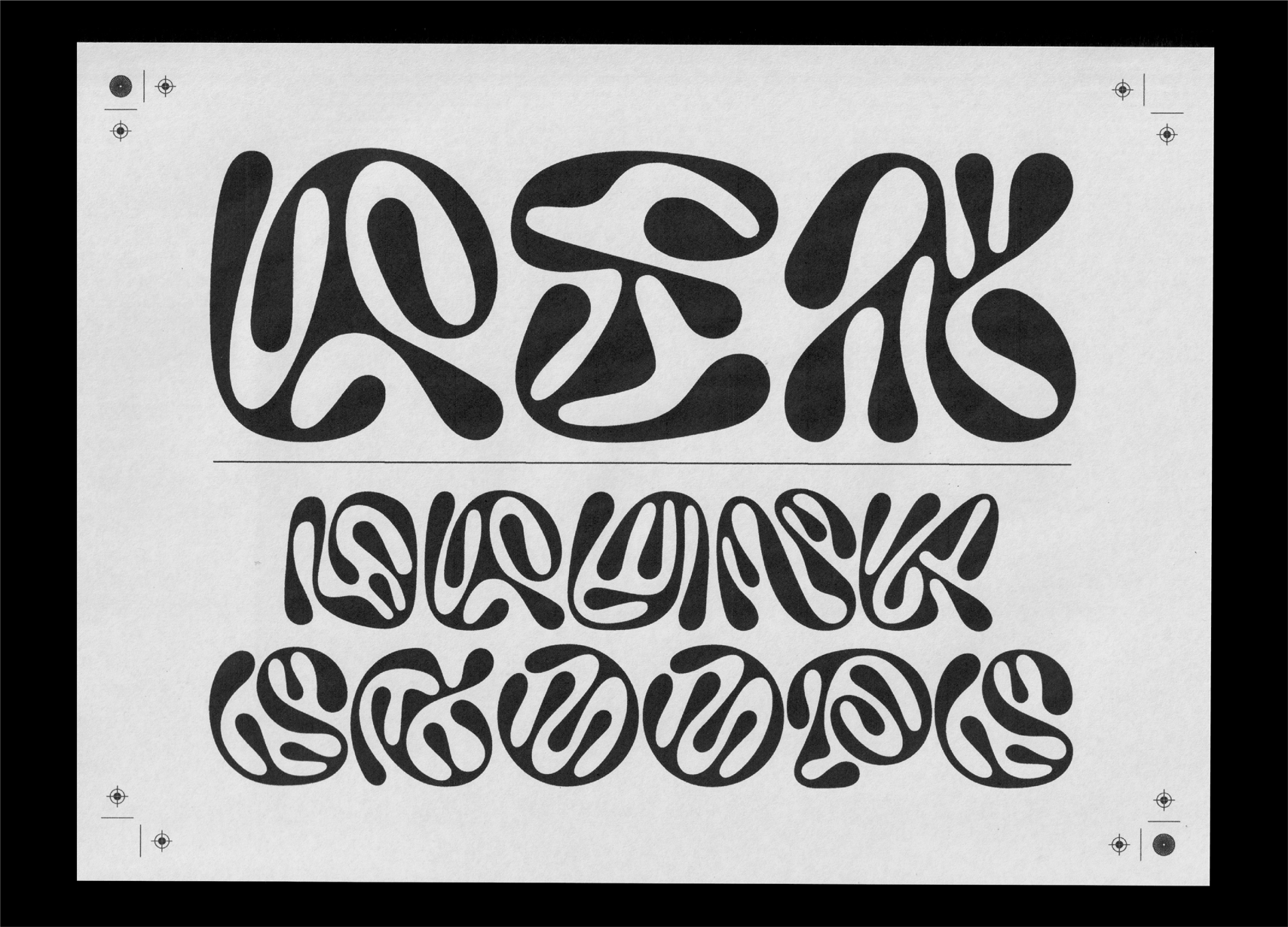
OMNIVERSE (2023)
“OMNIVERSE” language system based on crop circle patterns, combining elements of past, future, us and those beyond, reading as a non-timebound artefact of semi-illegible communication.
Secondary “OMNIVERSE” influenced by wall patterns and computer panels from Alien (1979), another key exploration of our relationship with extraterrestrial life through visual language.
Completed while at Aether.
Baird Wordmark (2024)
Unrealised lettering for musician Baird, based on flower stems and Jobim’s “Tide”.
Dune System (2021)
Work-in-progress typeface produced as a foray in organic type design through Glyphs.
Forms inspired by John Schoenherr and Denis Villeneuve’s interpretations of sandworms and sandworm trails from Frank Herbert’s Dune (1965).
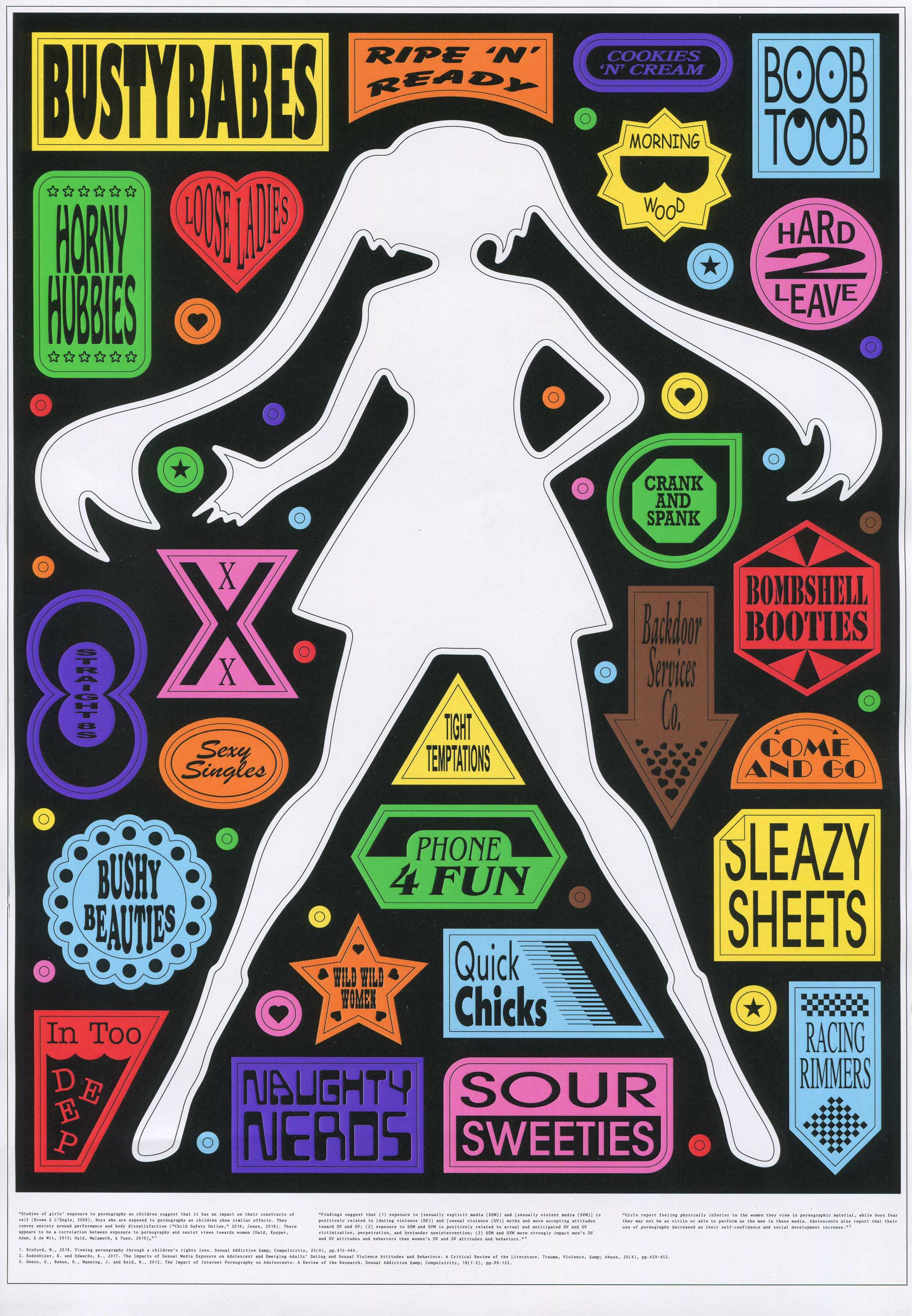
Porno Graphic (2023)
Porno Graphic discusses the increased sexualisation of children in modern television, film, and music media. Fictional sex solicitation badges inspired by both ‘70s/‘80s adult movie logos and erotic pop-up advertisements adorn the poster, intended to overwhelm and capture the viewer as the sea of sexualised media and pornography floods the visual landscape.
In the poster’s centre stands an anime school-girl figure, a now ubiquitous symbol of sex in hentai and pornography, a reputation perpetuated through teenager, student-teacher, and family categories of adult films. Trapped inside an all-consuming body of vibrant pornographic advertisements, she is absorbed in the cycle that will continue to exploit her.
On the poster’s footer, excerpts from peer-reviewed studies highlight side effects of pornography on developing adolescent brains, including poor self-esteem, anxiety, misogyny, and both dating and sexual violence.
Sonny (2021)
Design and packaging for a hypothetical skincare product intended to reflect the emotional experience of skin maintenance, transcending traditional gender stereotypes.
Emotional associations with skincare collected through informal questionnaires.
Expressive custom typography presented on a stark backdrop parallels the juxtaposition between the form of box and cream, balancing masculine and feminine.
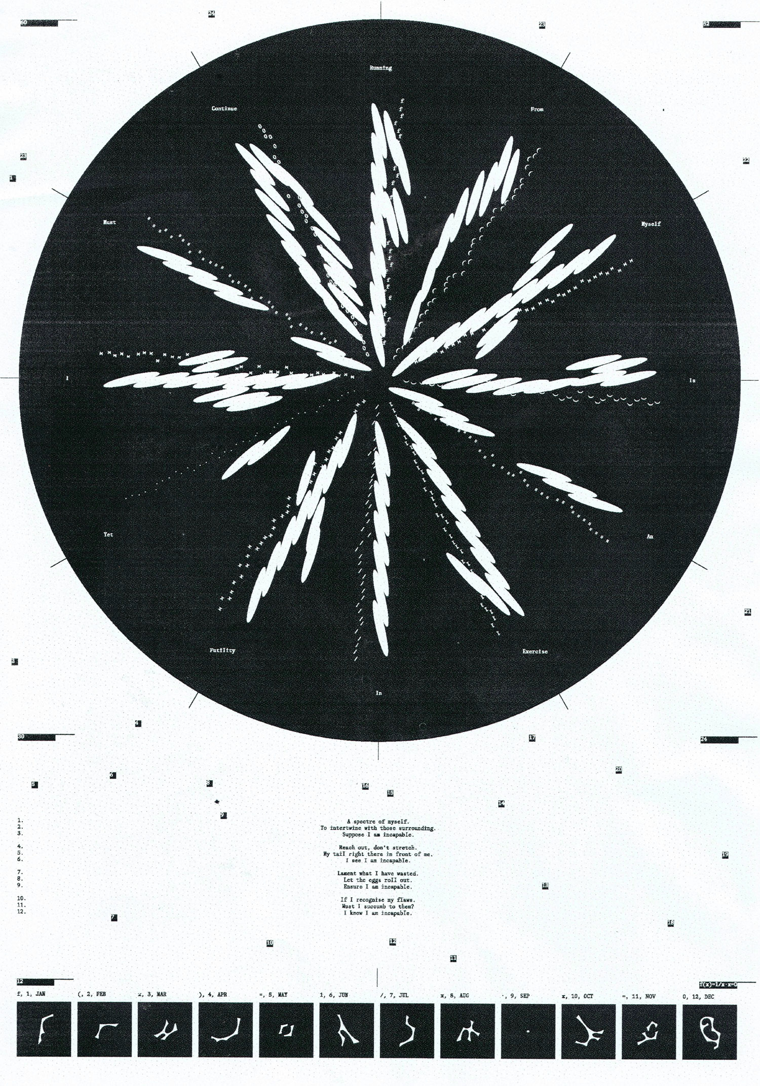
Mobius (2023)
Poster on the cyclicality of time, and our roles as actors in our lives.
Central “f(x)=1/x.x=0” lettering uses sundial shadows as the construction foundation, while 24 scattered points mark touchpoints of our routines. They are selected “at random”, by hand and with intention.
Briefed by Aether.
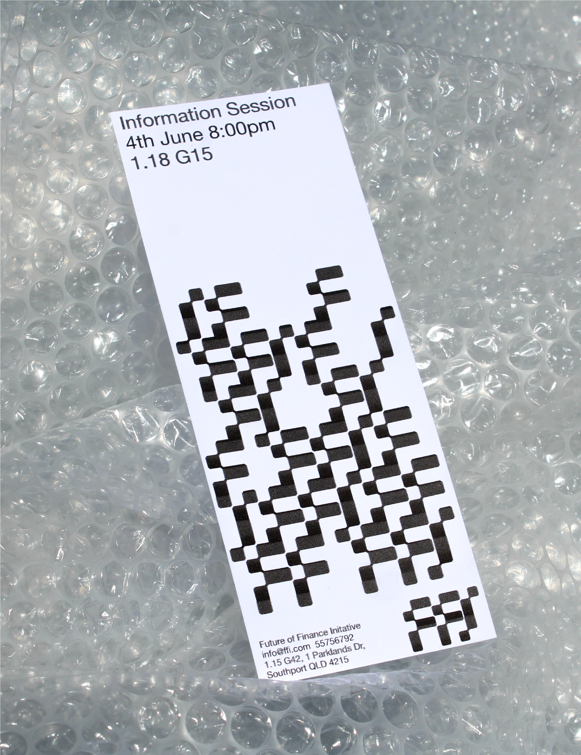
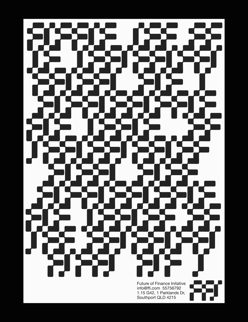
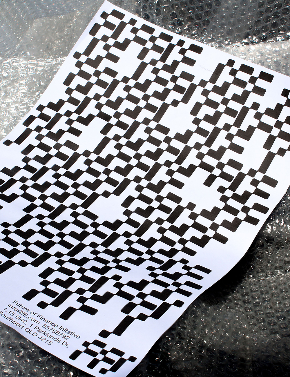
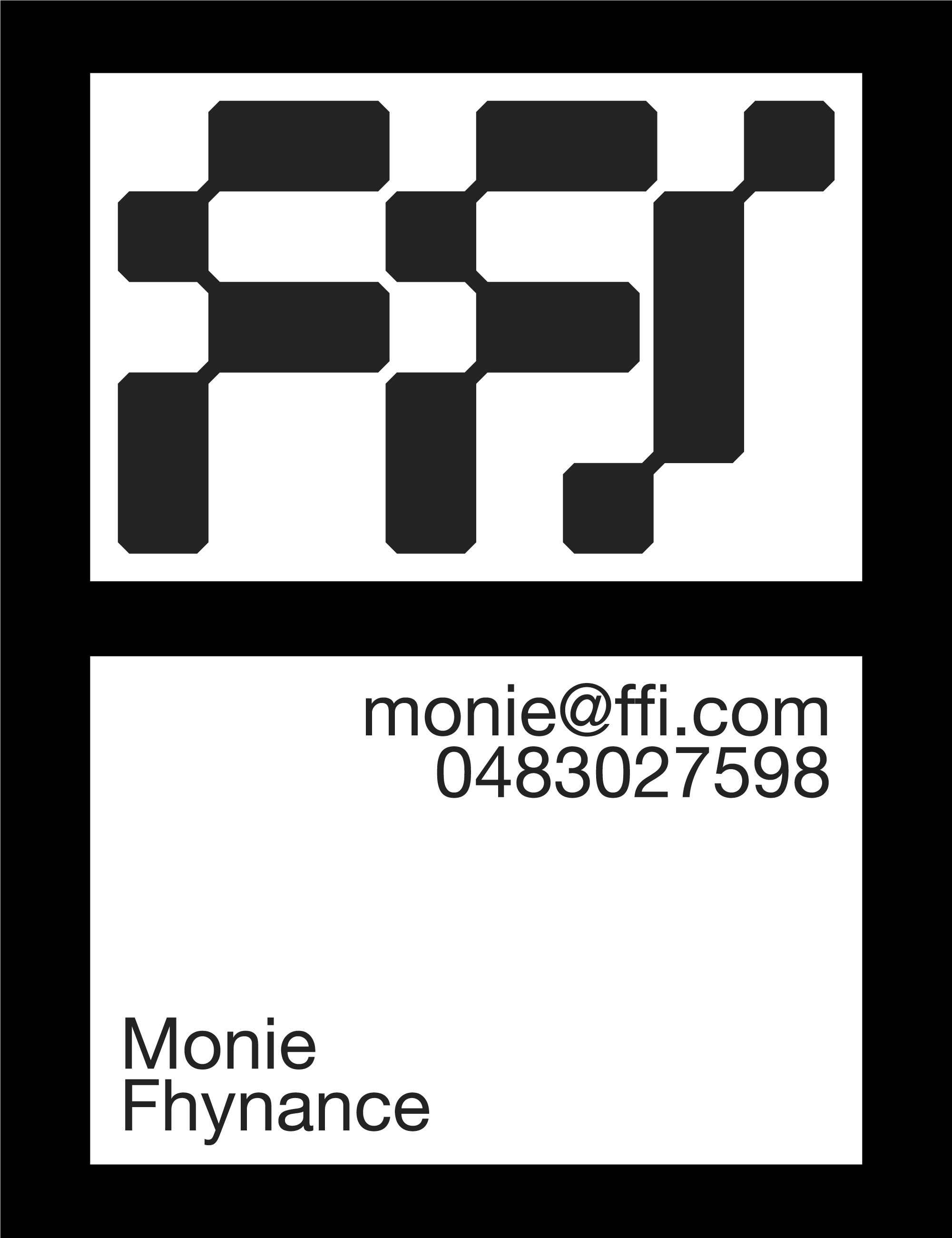
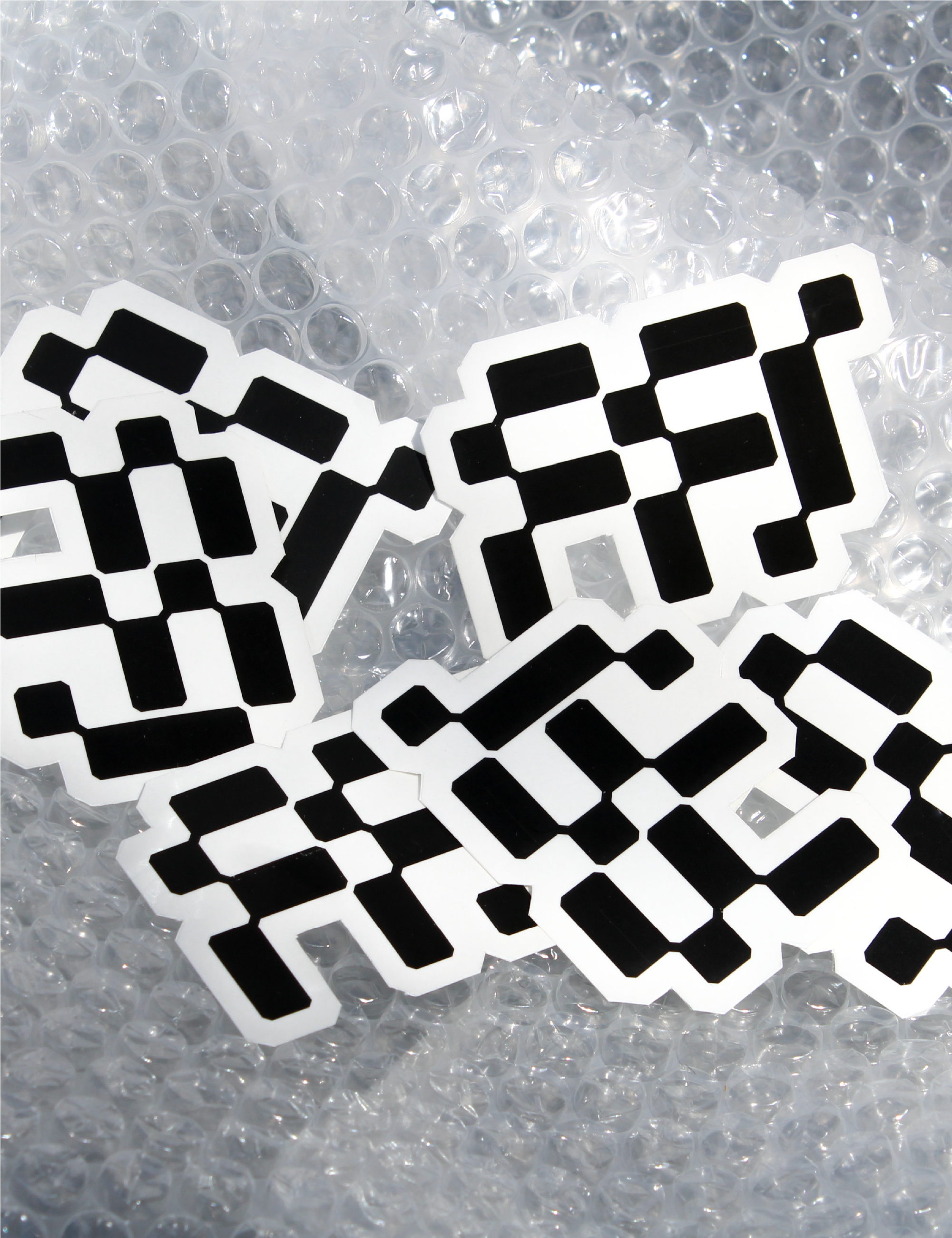
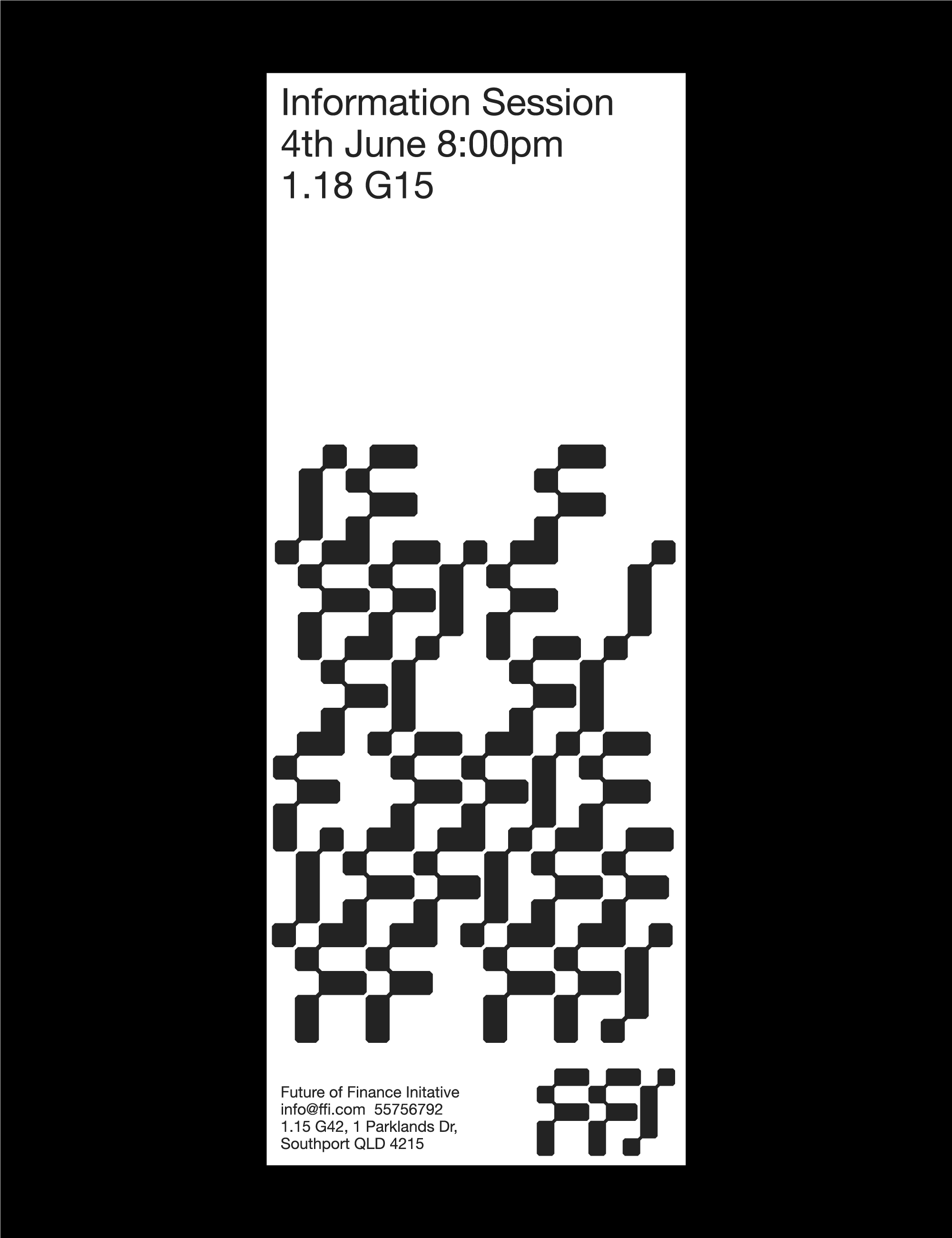
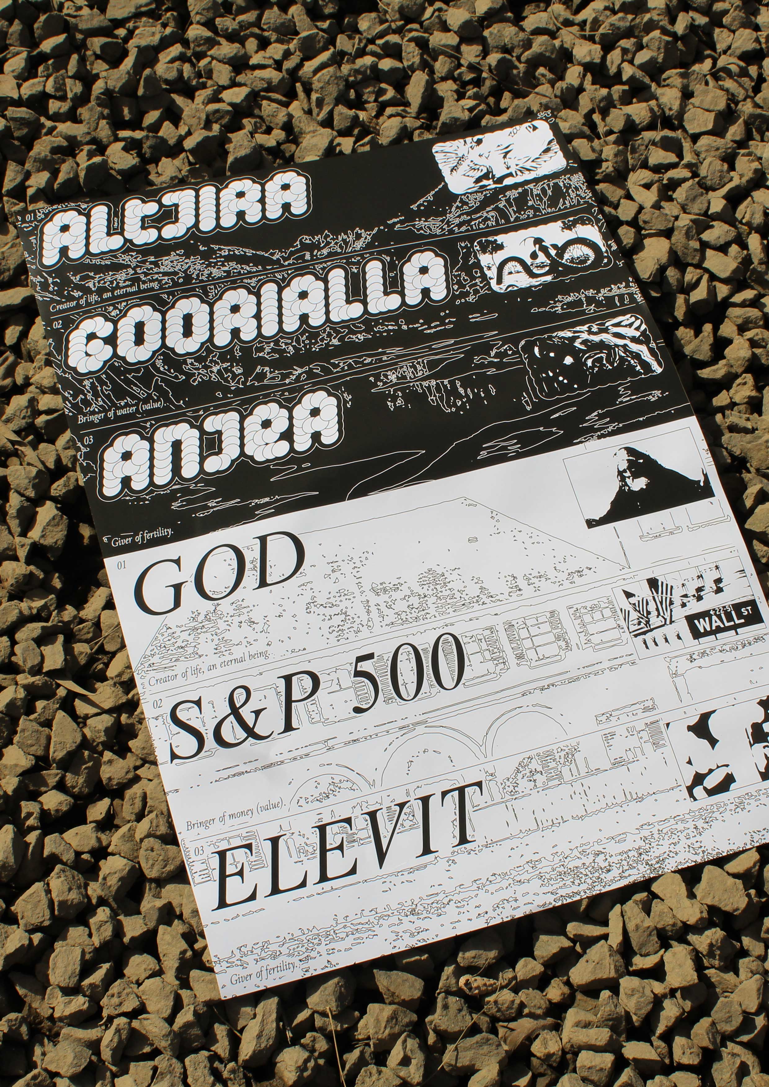
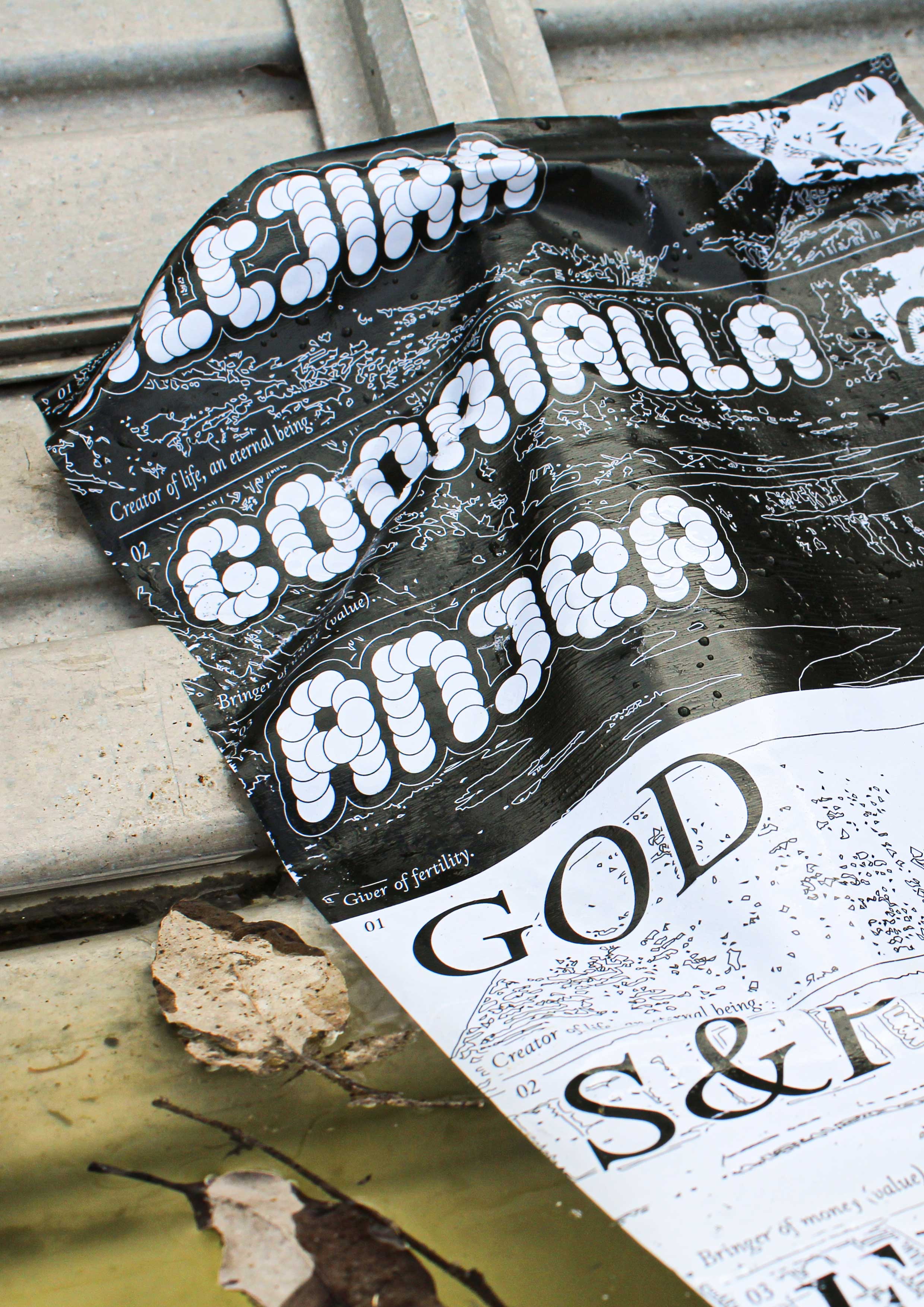
Future of Finance Initiative (2021)
Proposed
branding and promotion for Griffith University’s Future of Finance Initiative,
a student-led organisation advancing youth financial knowledge
around social impact investment and positive divestment.
Tessellated dragonfly wings and Excel grids form the basis of the wordmark, creating harmony between organic and mechanical, as FFI uses traditional investment strategies to further socially-responsible causes.
A grid-built FFI
wordmark is used to create a series of unique and organic patterns which visually
represent distinctive and individualised forms of social investment, breaking
free from the framework of traditional finance to produce something more purposeful.
ZONFI Icons (2023)
Selected and unselected icons for ZONFI’s redesigned line of safes, intended to represent 6 concepts: Style, Expansion, Loading, UI, Selection, and Security.
Completed while at Aether.
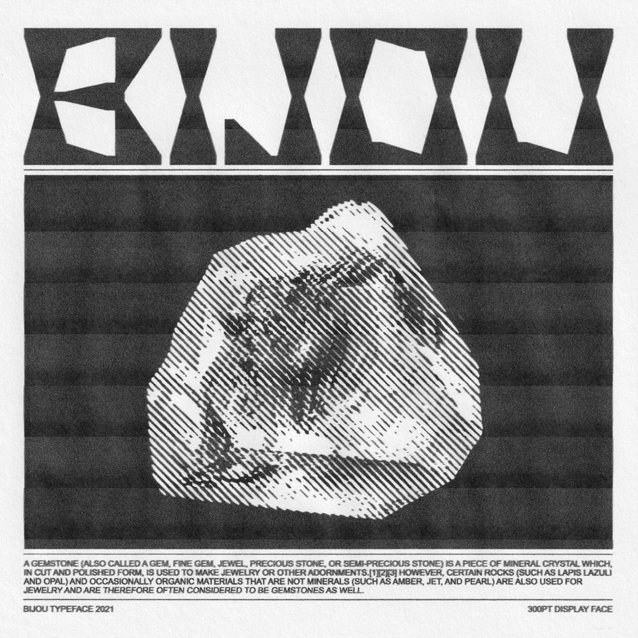
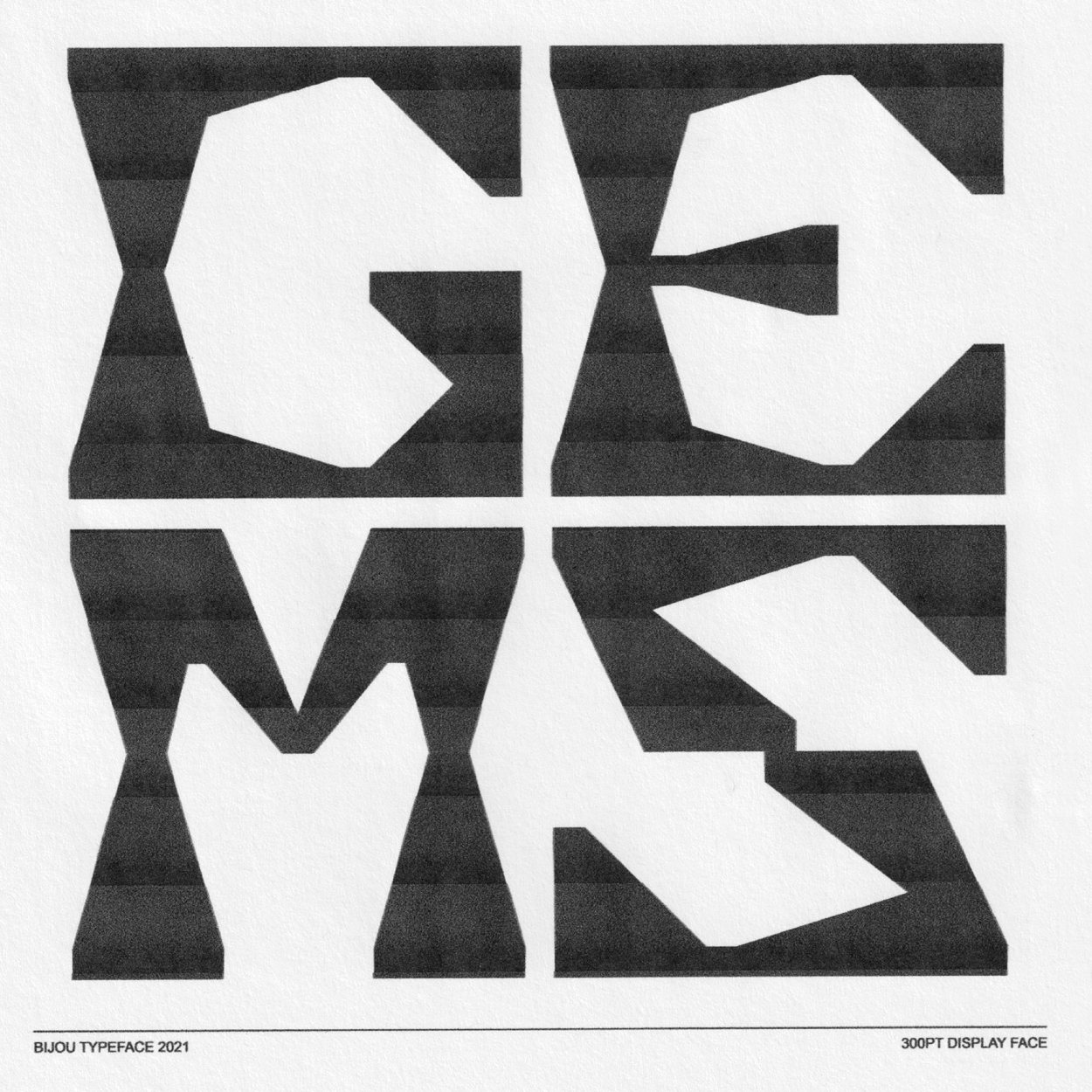
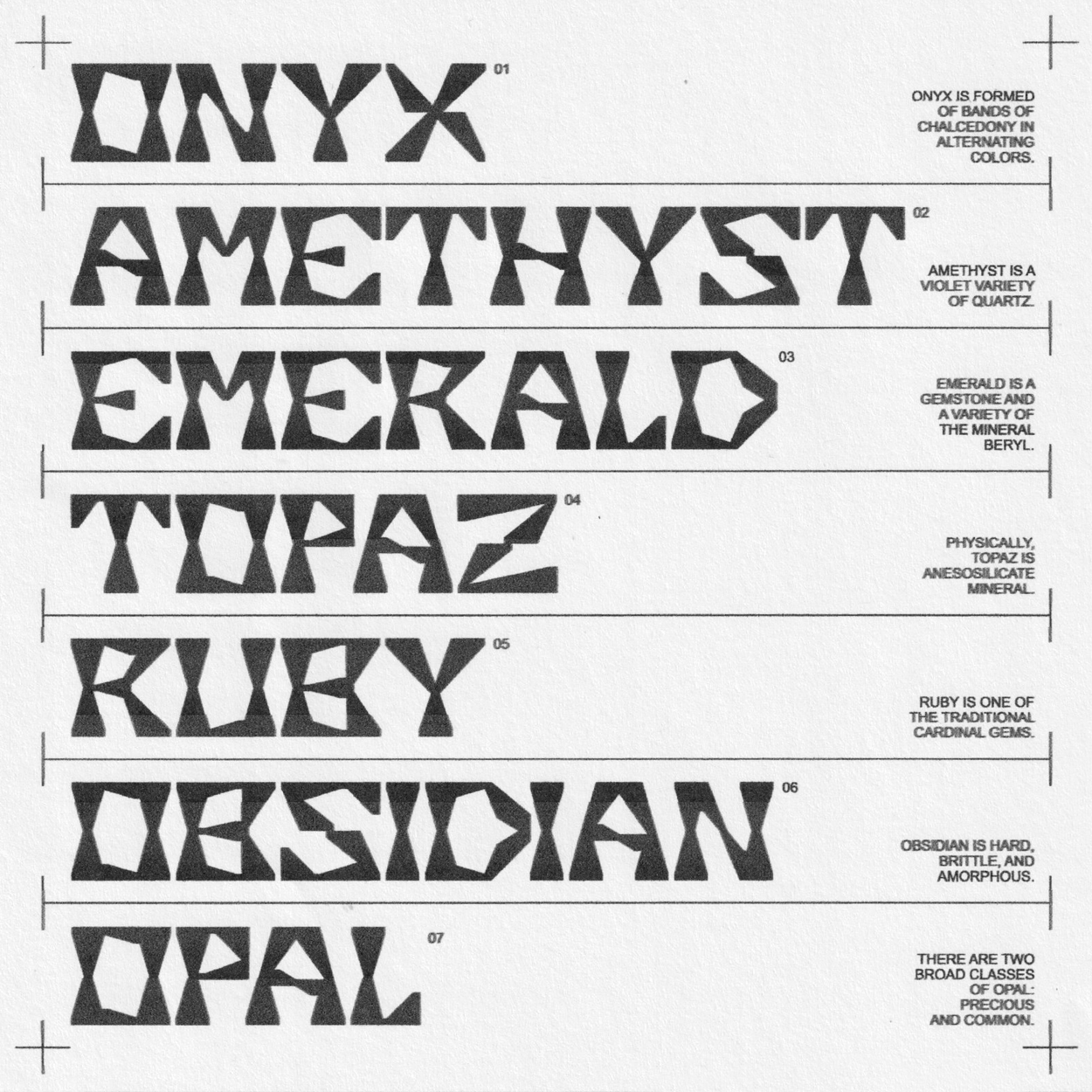
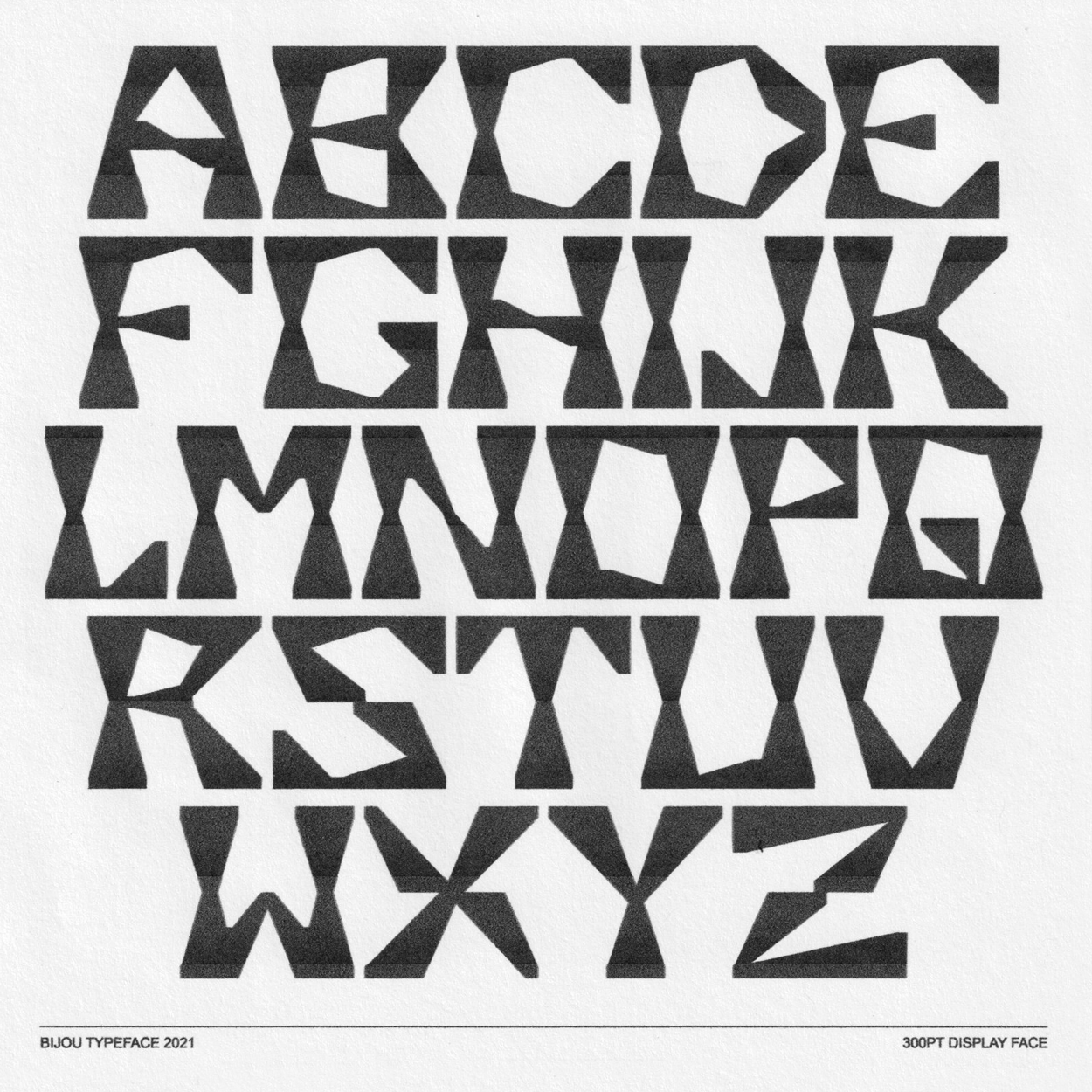
Bijou (2021)
Meaning ‘jewel’ in French, Bijou imitates the sharp cuts of diamonds and other precious gems to produce a boisterous display face that concurrently conveys both power and fragility.
Serving as inspiration for the visual language of “Uncut Gems”, Michael Graves’ accessible architecture and postmodernist ideologies influenced the direction of the typeface, along with the juxtaposition within the movie itself.
Built on a simple grid system, Bijou also draws a likeness to crude, papercut shapes, personifying youthful enthusiasm and unrestrained vigour, while remaining refined and considered in execution.
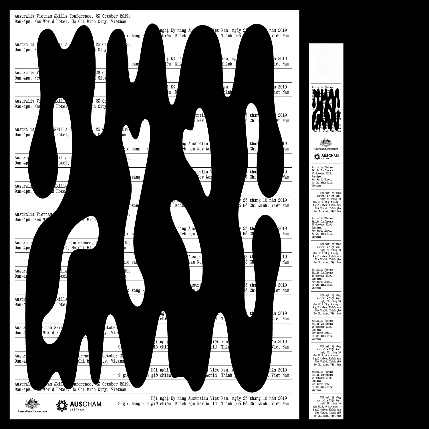
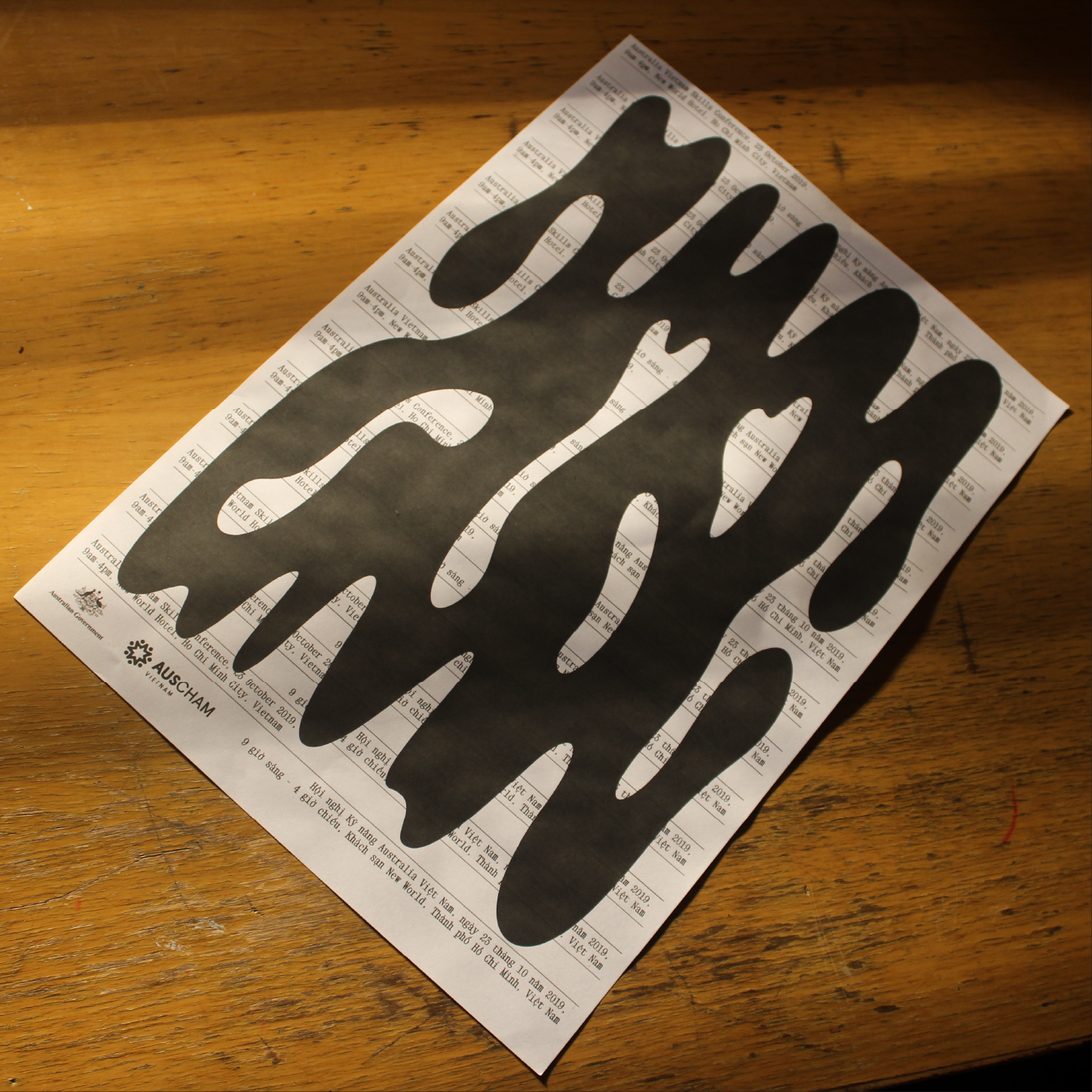
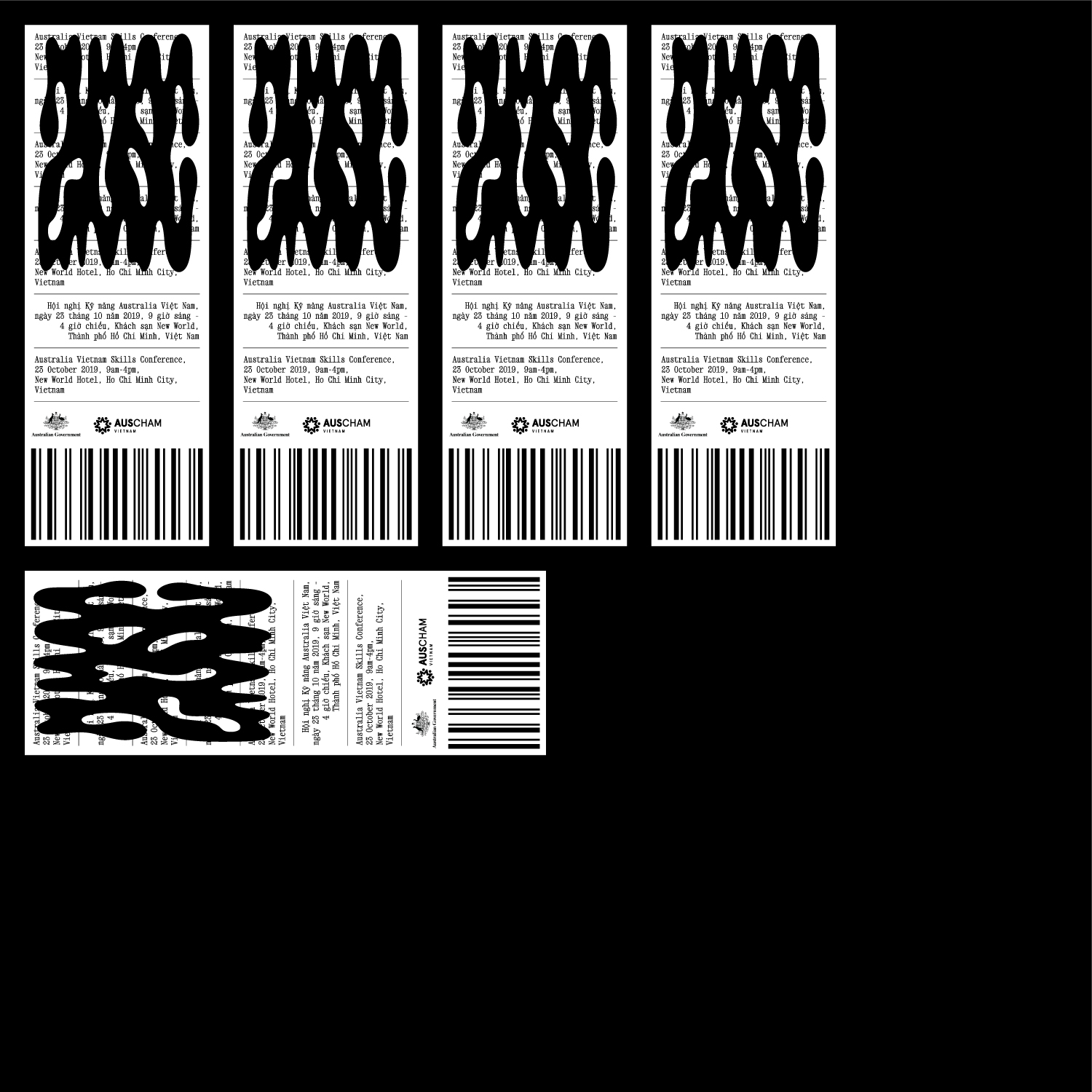
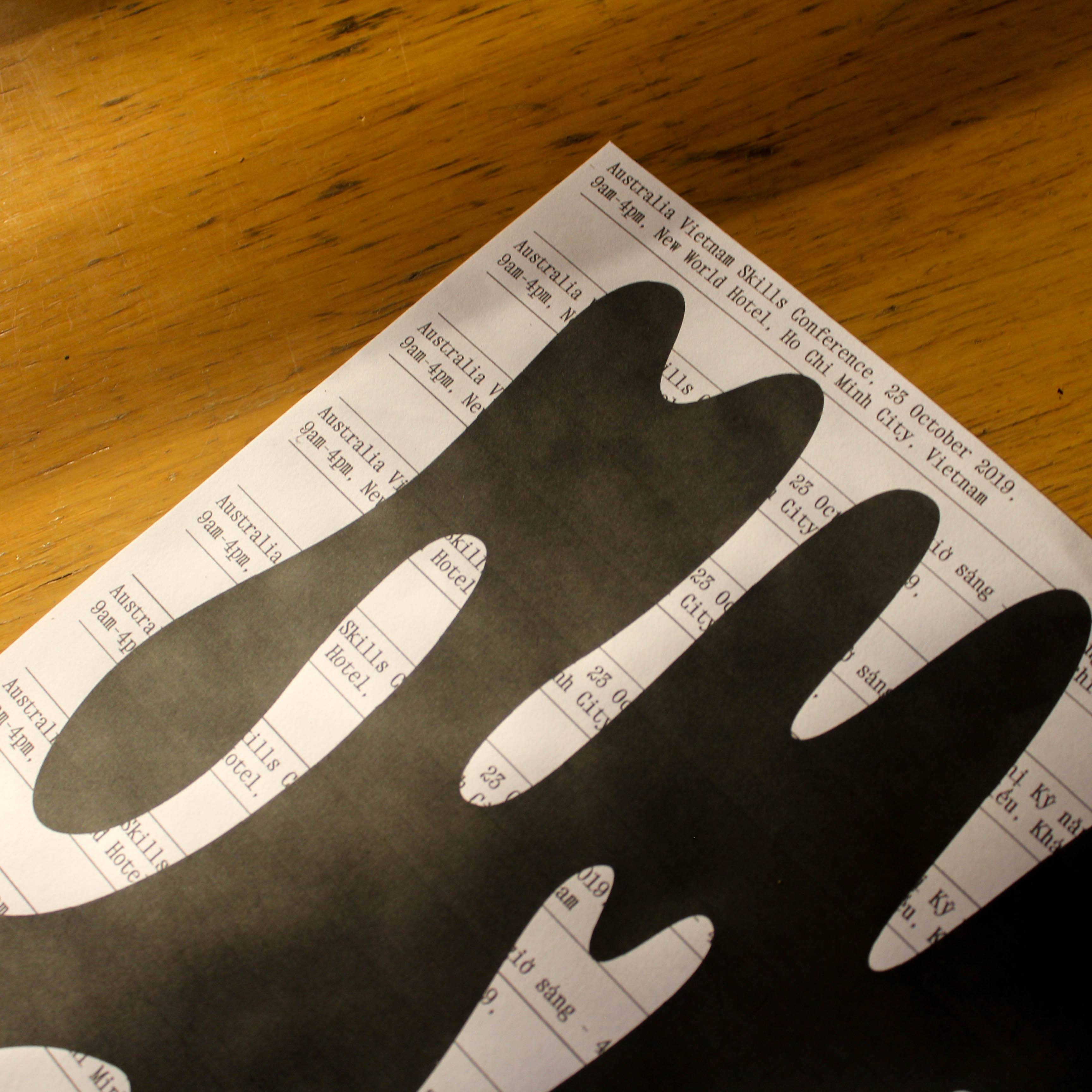
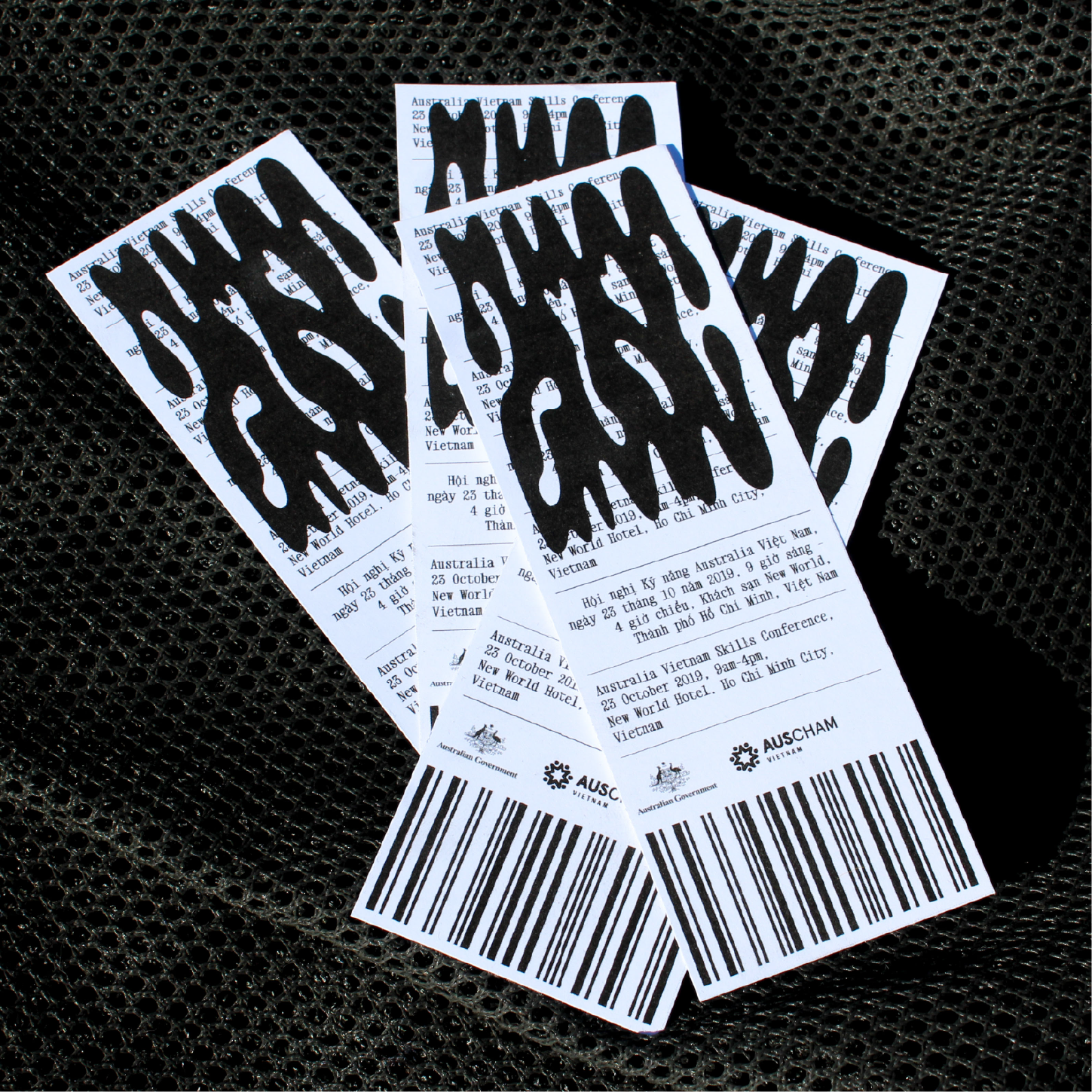
Australia Vietnam Skills Conference (2021)
Hypothetical
identity for a conference pitching the value of alternative
Vocational Education and Training programs for Vietnamese students and
enhancing Australian and Vietnamese governmental collaboration in an
ever-changing and increasingly multicultural education sector.
Communicating vocational training’s less formalised nature, and creating a union between both design cultures, custom typography draws from
Vietnamese wild postings with pronounced and decorative monochromatic type.
Secondary type presents key event details and mimics antique ticket stub
layouts.
Under the Rug (2021)
Poster design juxtaposing totems of
the Indigenous
Australian Dreamtime’s three
core worlds (sacred, physical and human) against their rough counterparts in my
non-Indigenous culture.
Type based on pieces created during Papunya Tula movement.
Visual dichotomy highlights the parasitic relationship
with material wealth prominent in Western culture that has ultimately driven the
exploitation of Indigenous peoples and land for short-term and superficial gain.
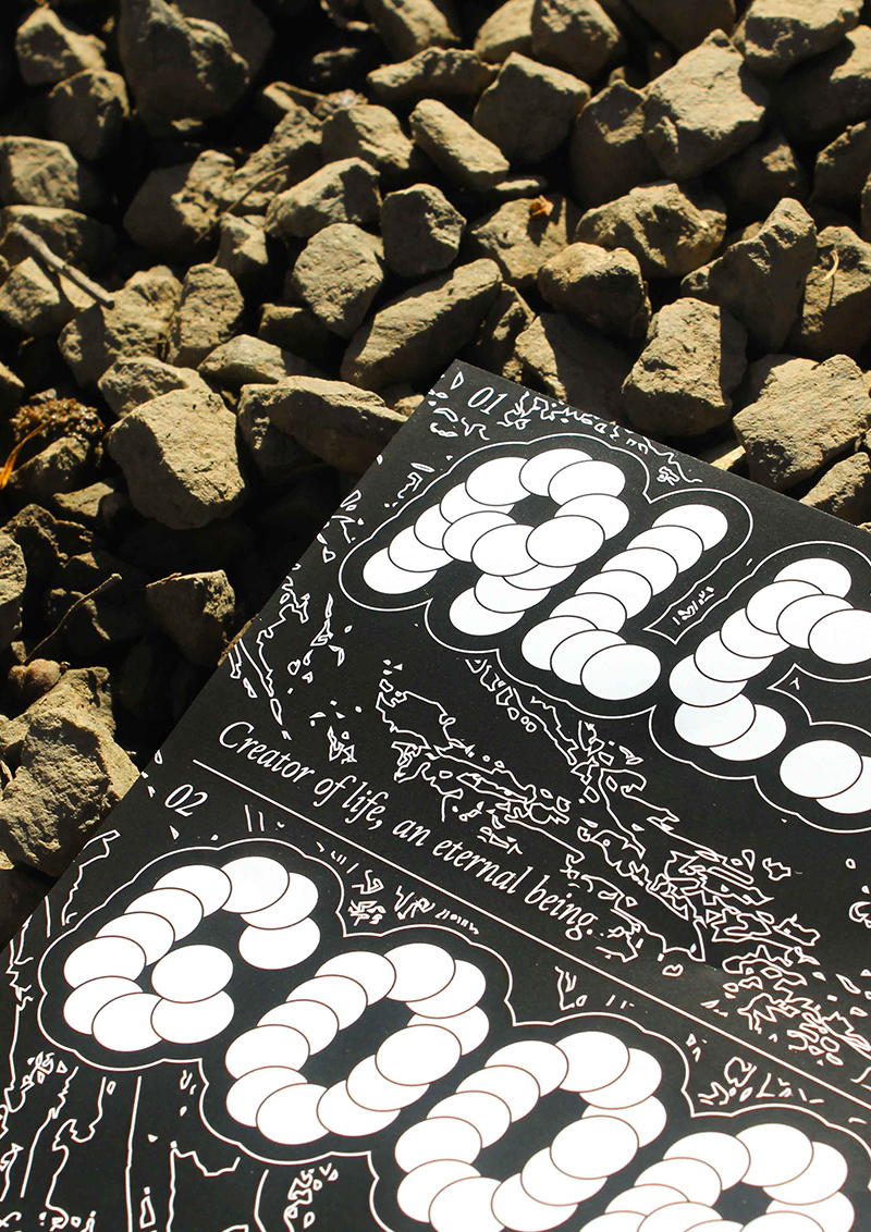
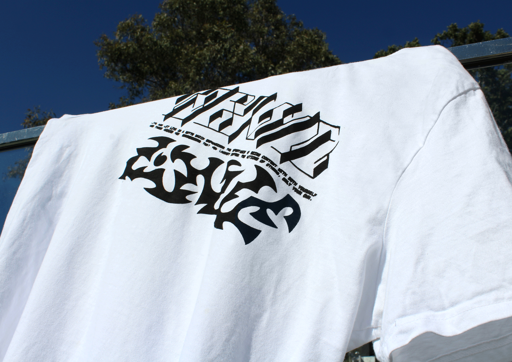
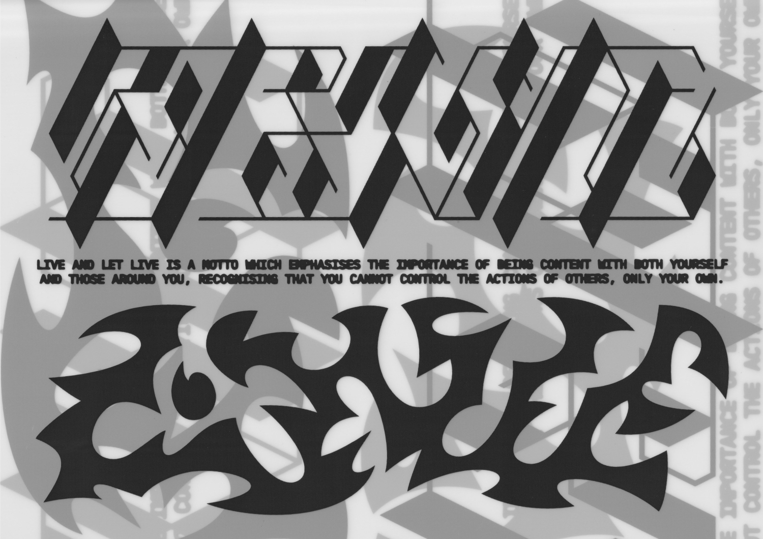
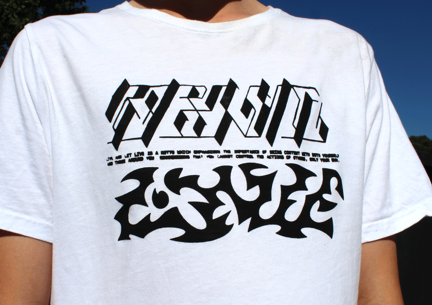
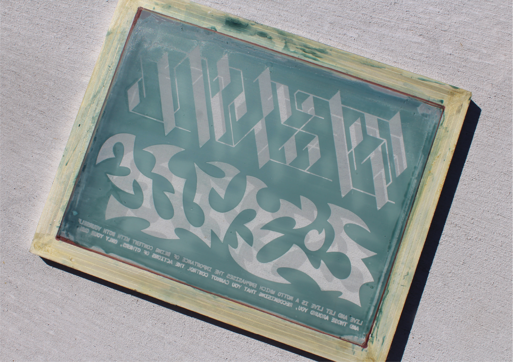
Live and Let Live (2021)
Garment design based on the medieval system of merchant law, ‘Live and Let Live’, which encourages accepting others’ behaviours and lives, in order to not squander your own.
Between the past “live” and current “live”, exists the current us. We, along with the type, find ourselves in a state of nowness, or harmony, between times, lifestyles, or manifestations of previous and projected selves.
Contrasting pieces of lettering, each based on artifacts from their respective visual period (Star Trek and our natural elements) are designed to evoke separate responses, whilst still populating the same canvas, indicative of the way we cohabitate as humans.